I'm a user experience designer that has some chops in user research, front end development, and artificial intelligence. I've worked in the digital space for over ten years and have had the privilege of redesigning several apps and websites from scratch. I'm also comfortable working within a design system and actively contributing to it.
I'm a dog person that owns a cat, and I'm a sucker for a good tango.
Please scroll down or click on the links in the menu to take a look at my portfolio.
Sherpath
Sherpath is an online learning platform for Nursing school produced by Elsevier. Instructors can assign course materials, lessons, and quizzes to students to help them effectively prepare for a Nursing career.
My Role was to lead the user experience of Sherpath. I made wireframes, conducted user research, and finalized designs so that Sherpath is usable for both instructors and students. I was the only designer on the Sherpath team but worked with designers for other products in order to maintain Elsevier's brand.
Background
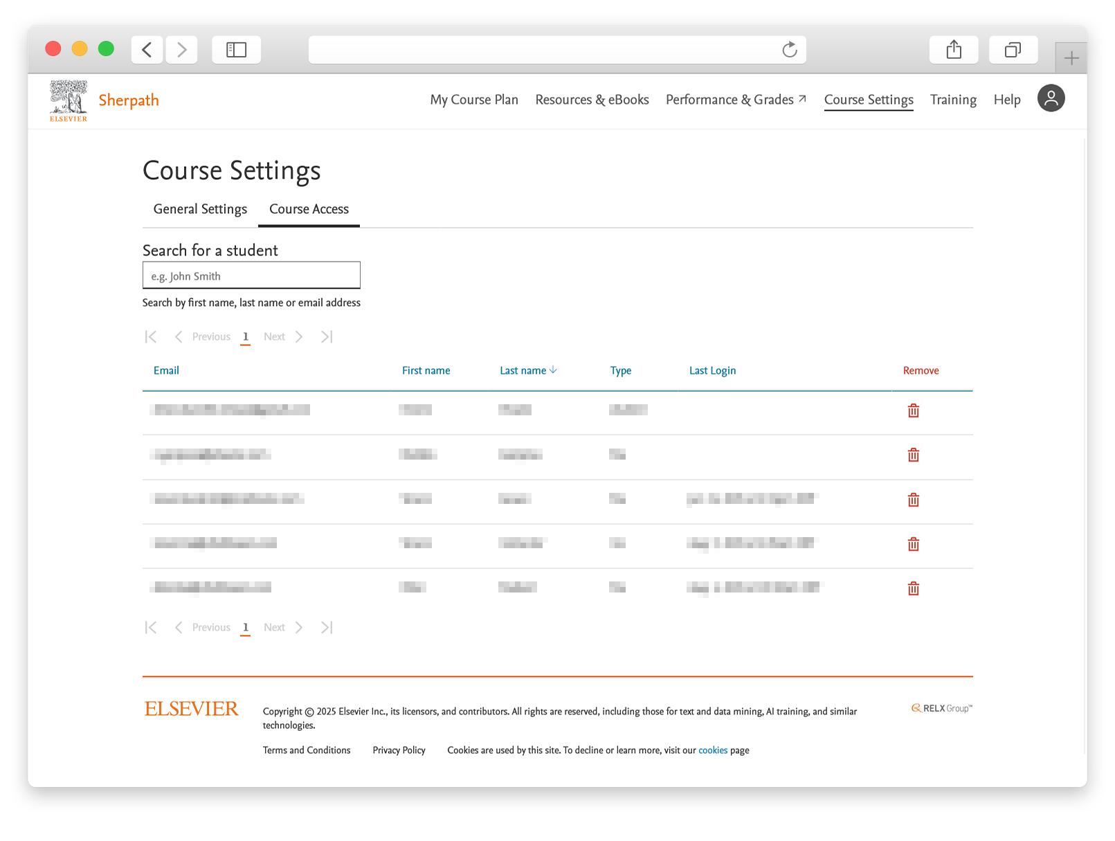
Elsevier is primarily an academic publishing company that specializes in medical, technical, and scientific content. Sherpath, the product that I worked on, is the online platform that gets paired with Elsevier's nursing textbooks. It contains extra content like lessons, quizzes, and activities that are meant to aide instructors and students in a Nursing School setting.
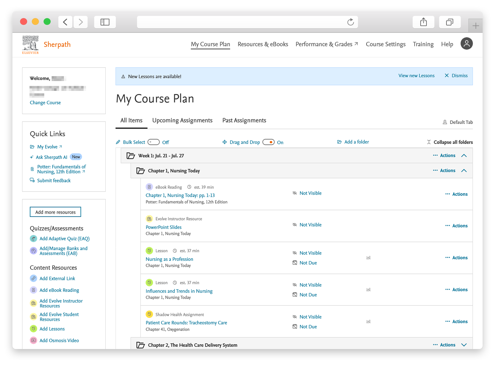
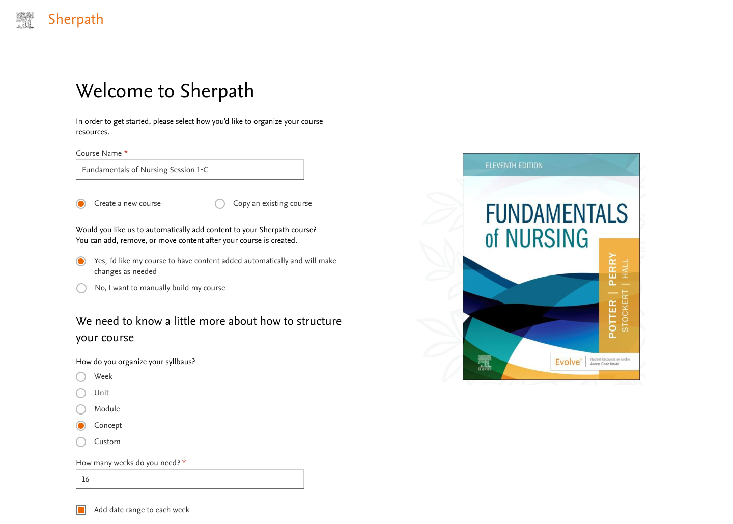
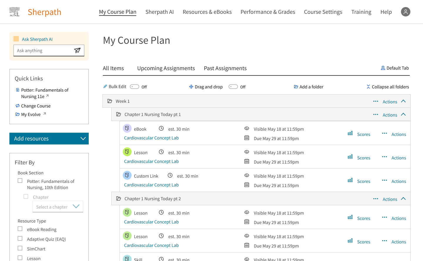
Through my time at Elsevier, Sherpath has moved from a version initially designed in 2015 to a next gen version that is currently in production. Here's what Sherpath looks like right now:
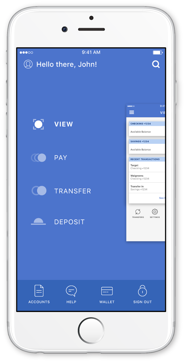
Sherpath AI
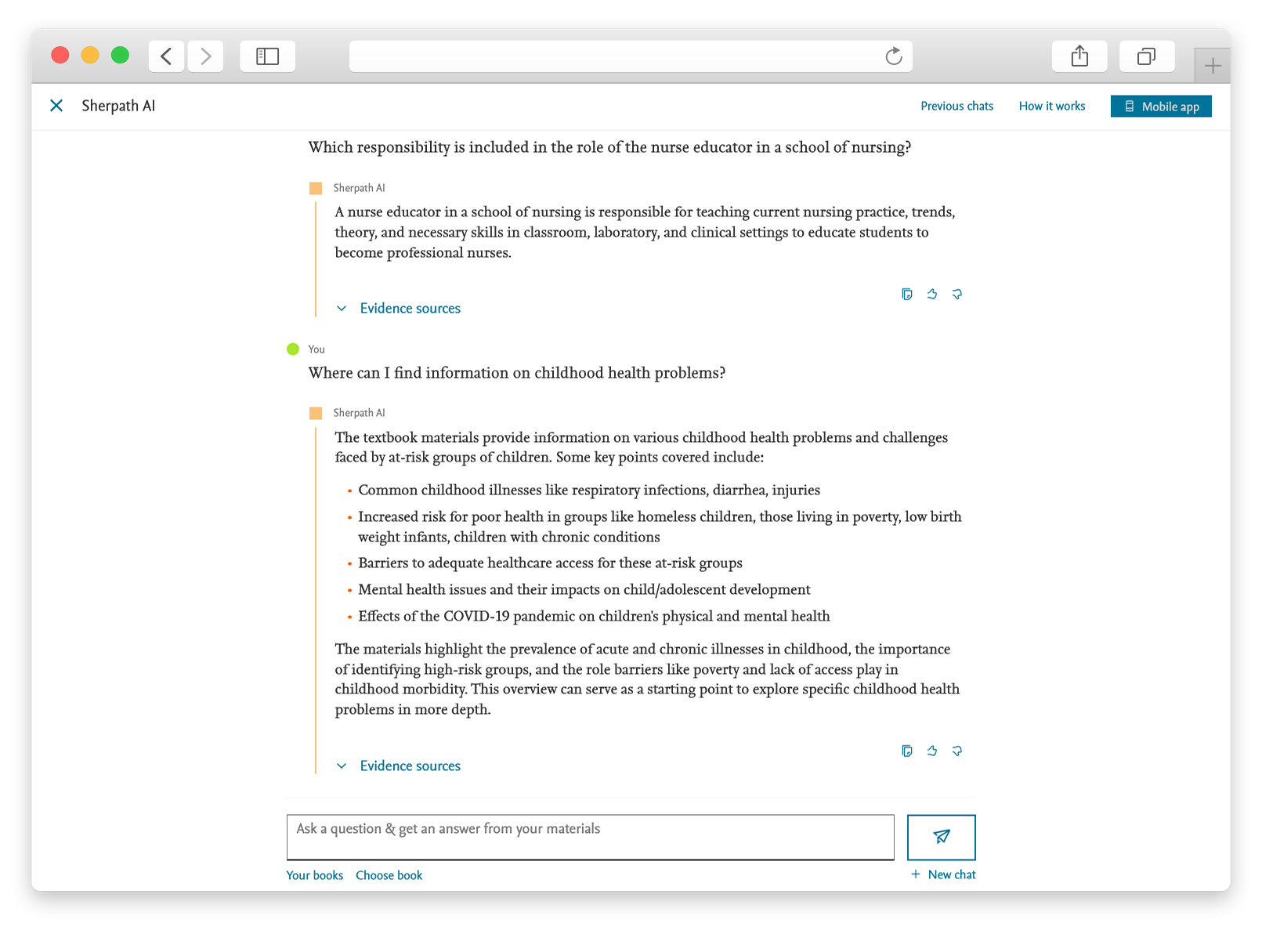
Sherpath AI is an artifical intelligence chatbot that Elsevier offers to students to help them with their studies. The traffic to the bot wasn't quite as heavy as we would have liked, so it fell to me to design a solution that would encourage more usage out of the Sherpath AI tool. At the time, the only access to Sherpath AI was a couple of links within the Sherpath course plan page. The experience felt separate and often forgotten among the other features that Sherpath has to offer. To combat this, I designed several iterations of what Sherpath AI would look like if it were more integrated in the user flow. Rather than simply making the link bigger or flashier, How can we make the user more drawn to use the AI tool. What does AI look like in the process of doing a lesson? How can AI help a user study better?
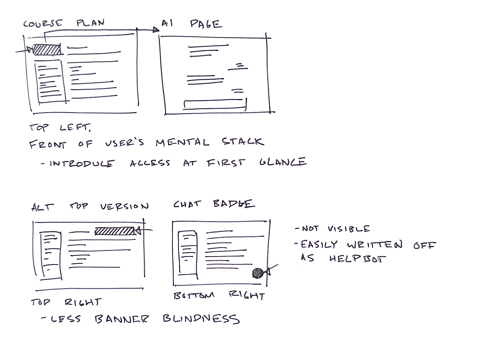
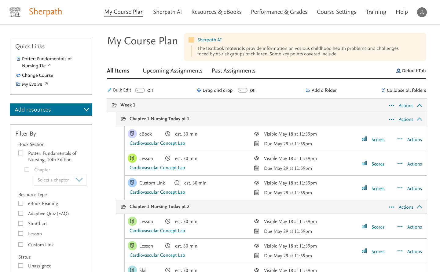
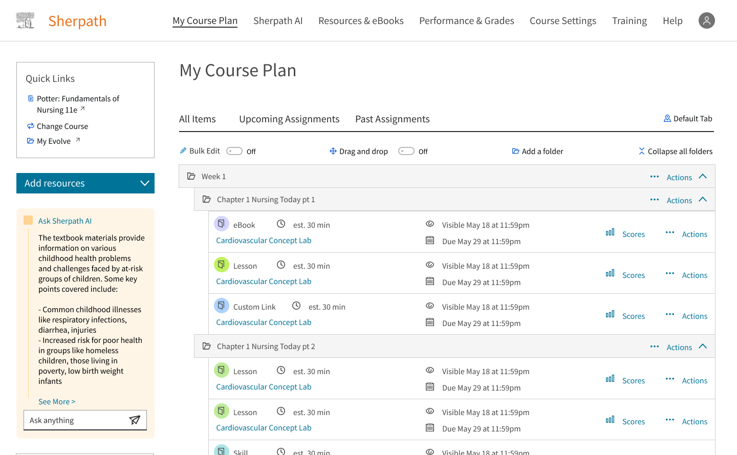
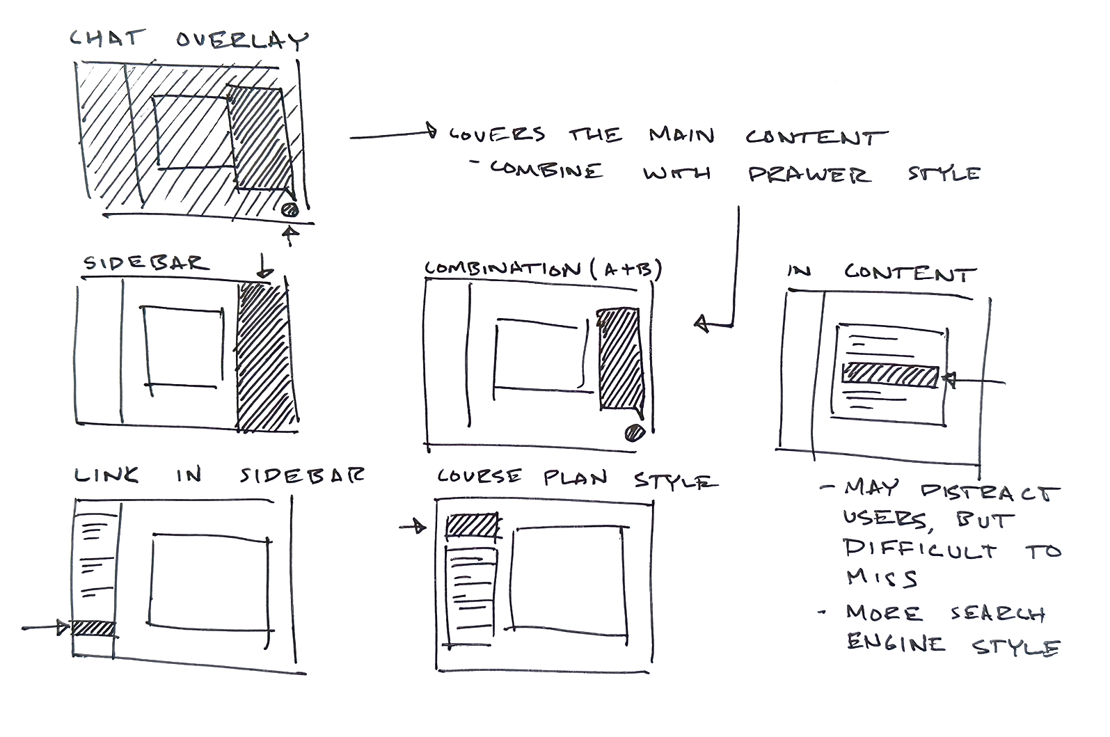
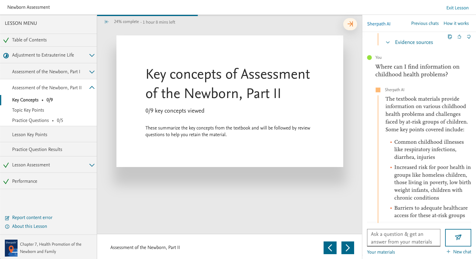
Here are a couple of the ideas that were produced. I played with the idea of making AI more accessible in the course plan page by giving the space interaction rather than a simple link. I also toyed with the idea of having Sherpath AI help the student understand what they were missing within the lesson. Or having Sherpath AI help students with what to focus on next in their studies.
User Testing
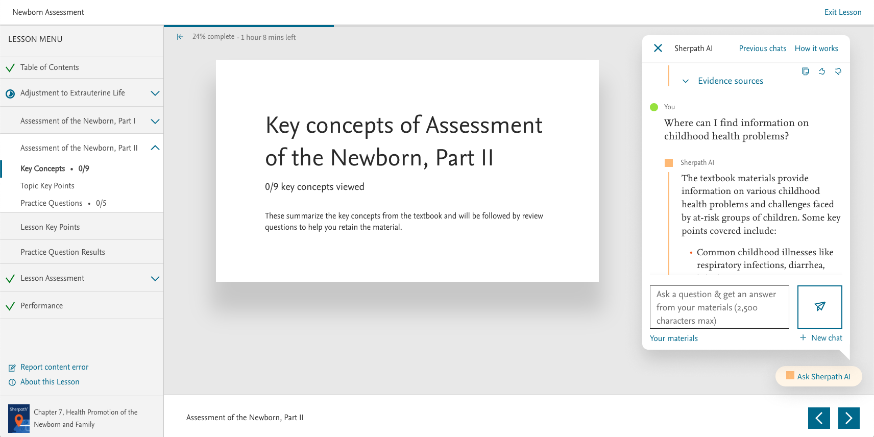
We tested each concept with a couple different methods. For the Course Plan page, we did a live A/B test between the side and top iterations. The metrics showed that users didn't really have a preference between the two versions, only that the versions were better than the current Sherpath AI link in the sidebar. Because of this, we decided to go with the left sidebar version to keep the experience a little more consistent with our other apps and also to be able to use the component on other pages like the Assignment Overview page.
For the lesson view, we tested our two concepts of what a portable AI chat would like. The first was more of a classic design that uses our current design library. I felt that users more often gravitate towards designs and patterns that they've already learned and feel comfortable using. The second concept is a more modern approach that feels more like a chat bubble. We found that this was more effective for our younger students who use their mobile phones more often. It introduces concepts from our next-gen design library that hasn't been implemented yet in our current designs. In the end, we found the idea of being able to drip feed the next-gen design library to our users very valuable. Because of that, we moved forward with the second design.
The last thing that we looked at was how to introduce Sherpath AI as more than just a chatbot. We toyed with concepts of how Sherpath AI could help students find gaps in their knowledge by using their homework performance data or recommending next steps by looking at their next due assignments and prioritizing them. Through our research we discovered that while students found AI helpful, instructors often didn't trust Sherpath AI to be knowledgeable enough to help. This discovery, paired with the technical difficulty of feeding performance and schedule data into a personalized AI made this concept deprioritized. For now, we decided that the effort simply wasn't worth it.
Final Designs
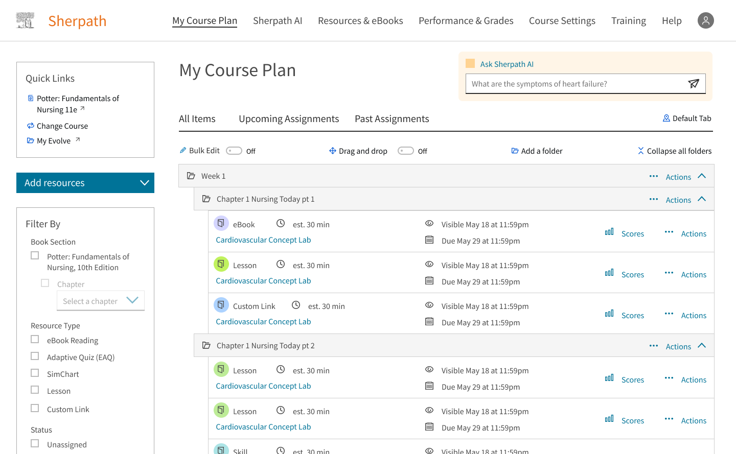
In the end, these were the screens that made it through testing. Sherpath AI would be more present on the course plan page by letting users interact with it there instead of having to click a link first. Sherpath AI would also be present in the assignment pages as a portable chat that users could interact with while doing their lessons to cross reference materials. As users get more comfortable with the idea of AI, I believe that the last concept we tested, the "personal assistant" style AI will be the most helpful in the end. But Elsevier, as of now, unfortunately has other things to prioritize.
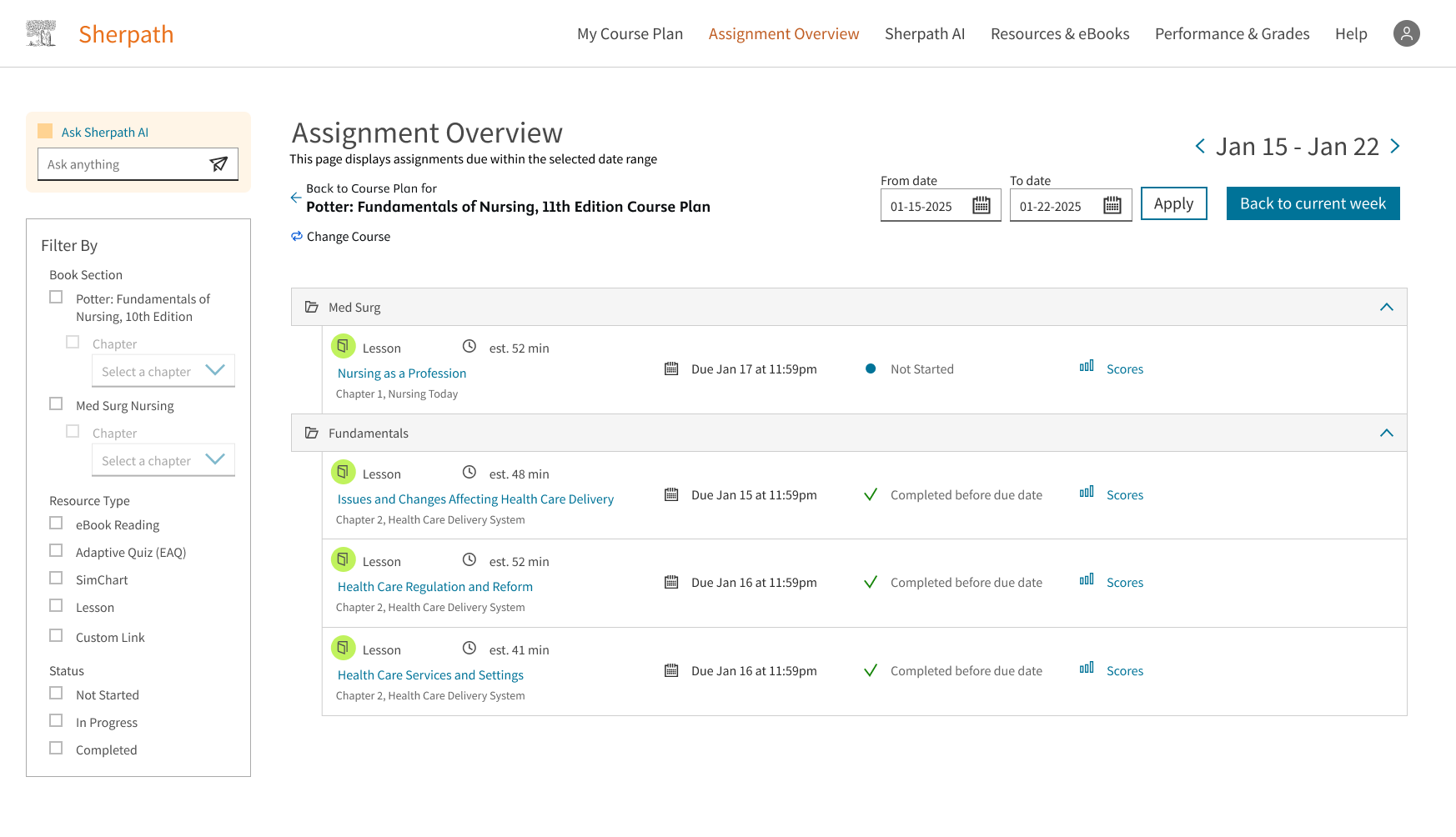
Assignment Overview
The Assignment Overview page is another feature that I designed to help students prioritize and organize their work more efficiently.
Identified Problems
Through copious user testing of Sherpath, a couple issues kept coming up in discussion from students and instructors.
-
It's hard to navigate between courses.
Users weren't always able to distinguish between different courses easily within Sherpath. The way that the Learning Management System worked was each course would open in a new tab. This led to many students having a glut of tabs in their browser as they navigated their coursework to study or do homework.
-
Instructors are often unorganized in the way that they structure their Sherpath courses.
The way that Sherpath was initially built was to have instructor and student courses look relatively the same. This way, instructors would be able to look over student courses and compare them to help troubleshoot any issues. We found that many instructors wouldn't put in the effort to organize the course in a way that was easy for students to parse.
-
Students often have four or five courses enrolled each semester.
In many cases, all of these courses are done through Sherpath. This means that each student has a Sherpath course with different instructors that had different styles of assigning work. Some instructors assign homework in a "flipped classroom" style. In this style, students are meant to do reading and homework before the instructor has their lecture, so they're more familiar with the subject matter. Other instructors choose to teach their classes in the more traditional way: lecture and then homework. This leads to confusion for students of which homework is due when and for what class.
To combat these issues, we decided to come up with an Assignment Overview. This page shows all of the active courses that a student is currently enrolled in, and all of the assignments with an upcoming due date. Here are some of the initial iterations that were designed:
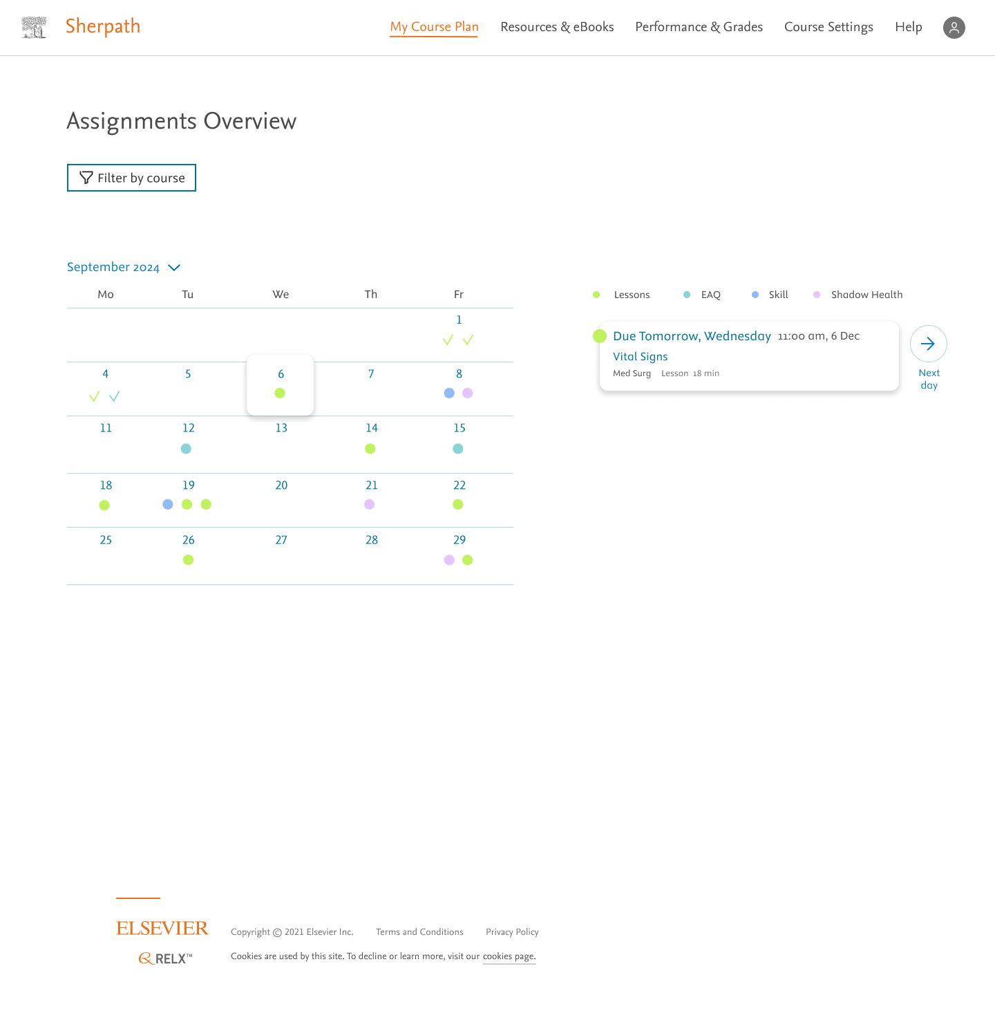
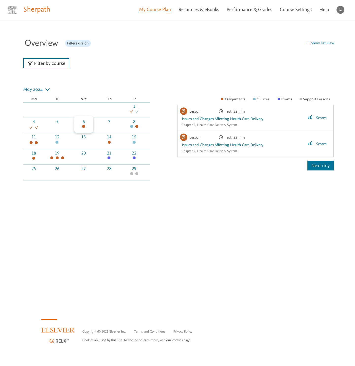
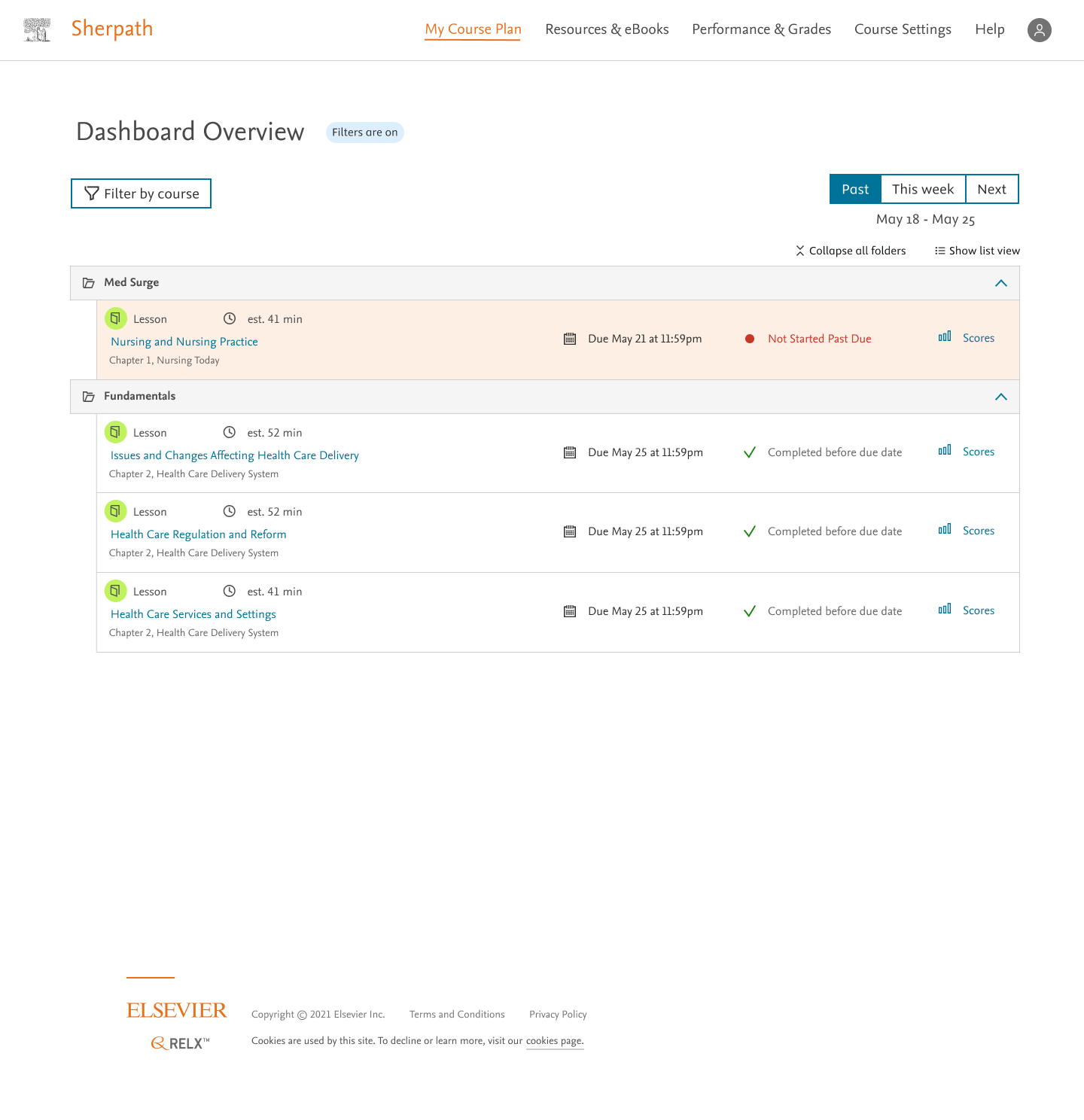
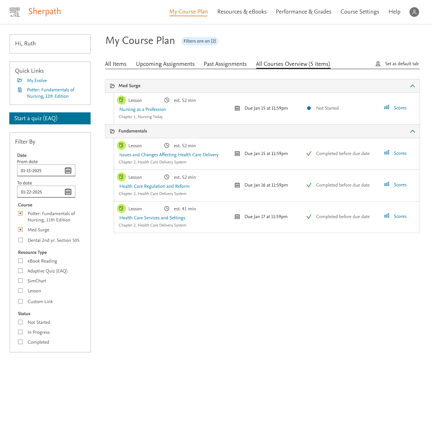
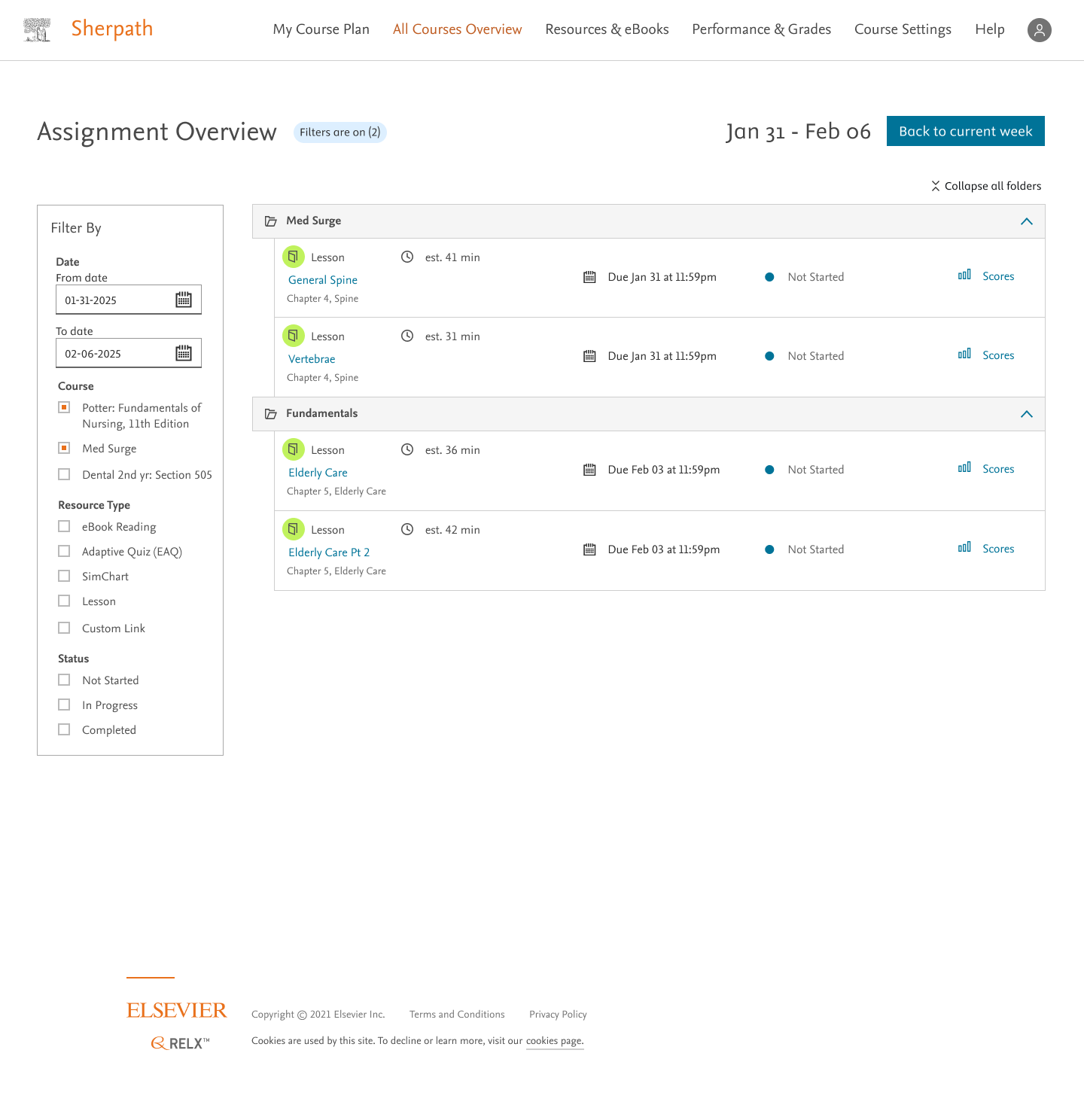
The big features of the page were to let students see all of the courses listed, let them filter the individual items, and let them set date ranges. This would allow students to tailor the page to their needs and plan as far out as they would like. We experimented with different methods of showing the passage of time. Calendar views, tile views, list views - we tested them all with students and instructors. The feedback was overwhelmingly positive, users said:
Oh my god, this is exactly what I was looking for. This is going to save me so much time, when does it come out? Can I have it now?
Is this out right now? When can I have it? This is such a game changer for me!
Though it was positive, there were still improvements to make. Users found the list view more comfortable since that's the way their courses are laid out. The filter section was also redone to match their current courses. Here's what the final designs looked like:
Things to work on in the future
One of the issues that arose when testing the final iterations were that students expected all of their resources, not just their due assignments to be on the page. This is something that I fought to try to do, but in the end, it wasn't technically feasible in the time that we had allotted for ourselves. The end evolution of this page is something that probably becomes more of a dashboard that represents all of their classes, not just a to do list. When that happens, I expect that the page will probably take over the course plan as the default page to land on when launching out of an LMS.
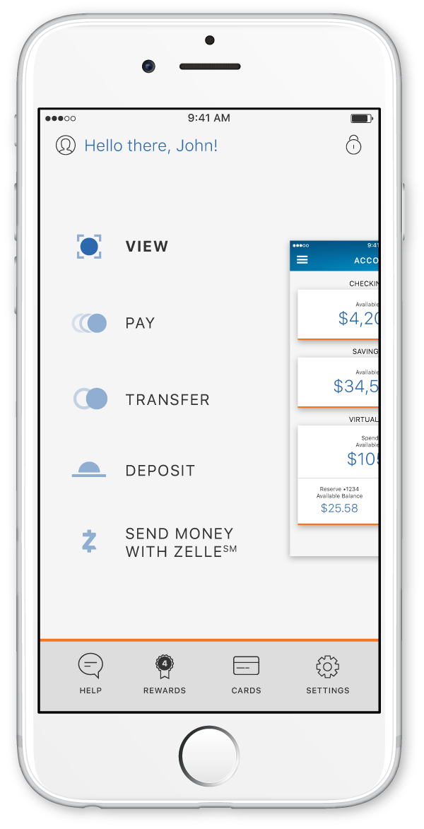
PNC
While at PNC, I worked on the mobile app as my main priority. The main goals that I established were to keep the app accessible, make it intuitive to navigate, and give the user a sense of security while using the app.
You can download the iOS app here and the Android app here.
Out with the Old
The old PNC app was an out of the box financial app that PNC had purchased from an external vendor. This meant that there were several inherent problems with it:
- We couldn't create our own features, we were dependent on what they had already built and could provide for us.
- Any updates that we wanted to make would have to go through them first.
- We weren't able to fix any bugs. We had to notify the vendor and let them handle it on their own timeline.
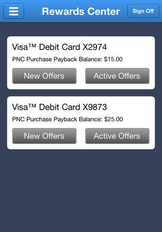
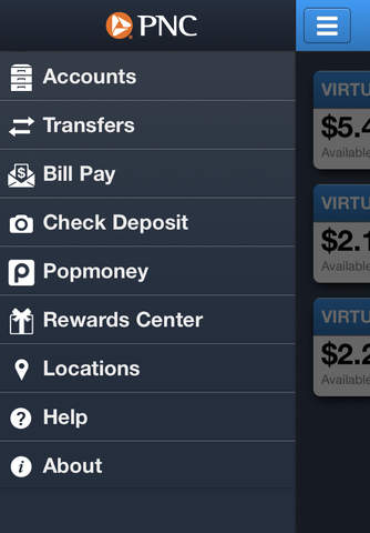
There were other issues with the app that we wanted to fix as well. The menu basically had no hierarchy, it was a flat list of all the features. That made it difficult for users to find what they were looking for until they developed muscle memory. But once we added new features, they had to relearn where everything was located. The overall experience of the app was lacking as well. It scored a whopping 1.9 stars in the Apple App Store.
Starting from Scratch
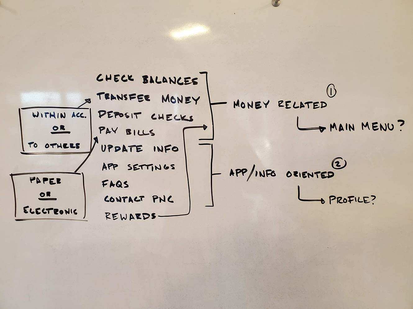
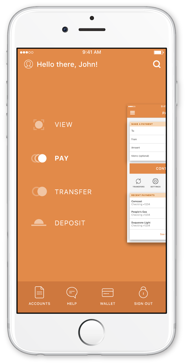
Luckily for me, I joined the PNC Mobile team when the design for the app was still in its infant state. I was able to start fresh and design the app fully from the ground up. The idea of distilling the main menu to core items was a big motivator here. The old app had a list of over 10 items on the main menu. It had no hierarchy and was extremely flat. In order to add some depth, we had to restructure the information architecture from the ground up. This gave way to a 3D space concept that the current designs still carry.
The first thing that I did was list out all the features on a white board. This list had no hierarchy and actually looked much like the menu of the old app. From there I started to organize each feature into a category. The list of items on the white board slowly became a word tree of items on the white board. From here I was able to start taking these word trees into user testing to see which resonated and made sense with a majority of our users. We went through many rounds of testing and finally came up with something that made sense. With this refined word tree, I was able to create a solid information architecture for the app.
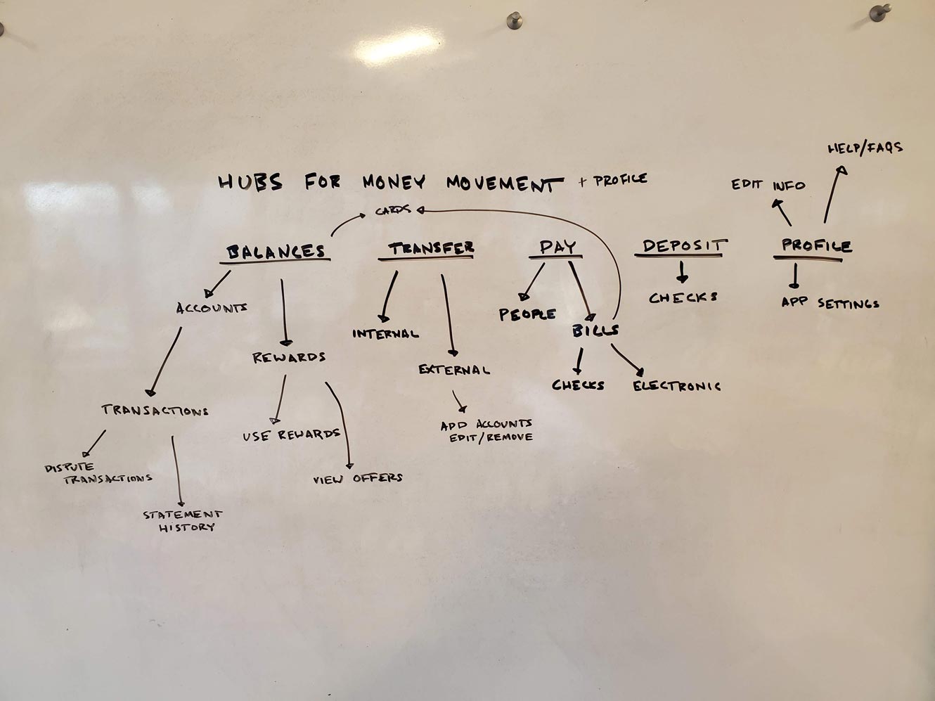
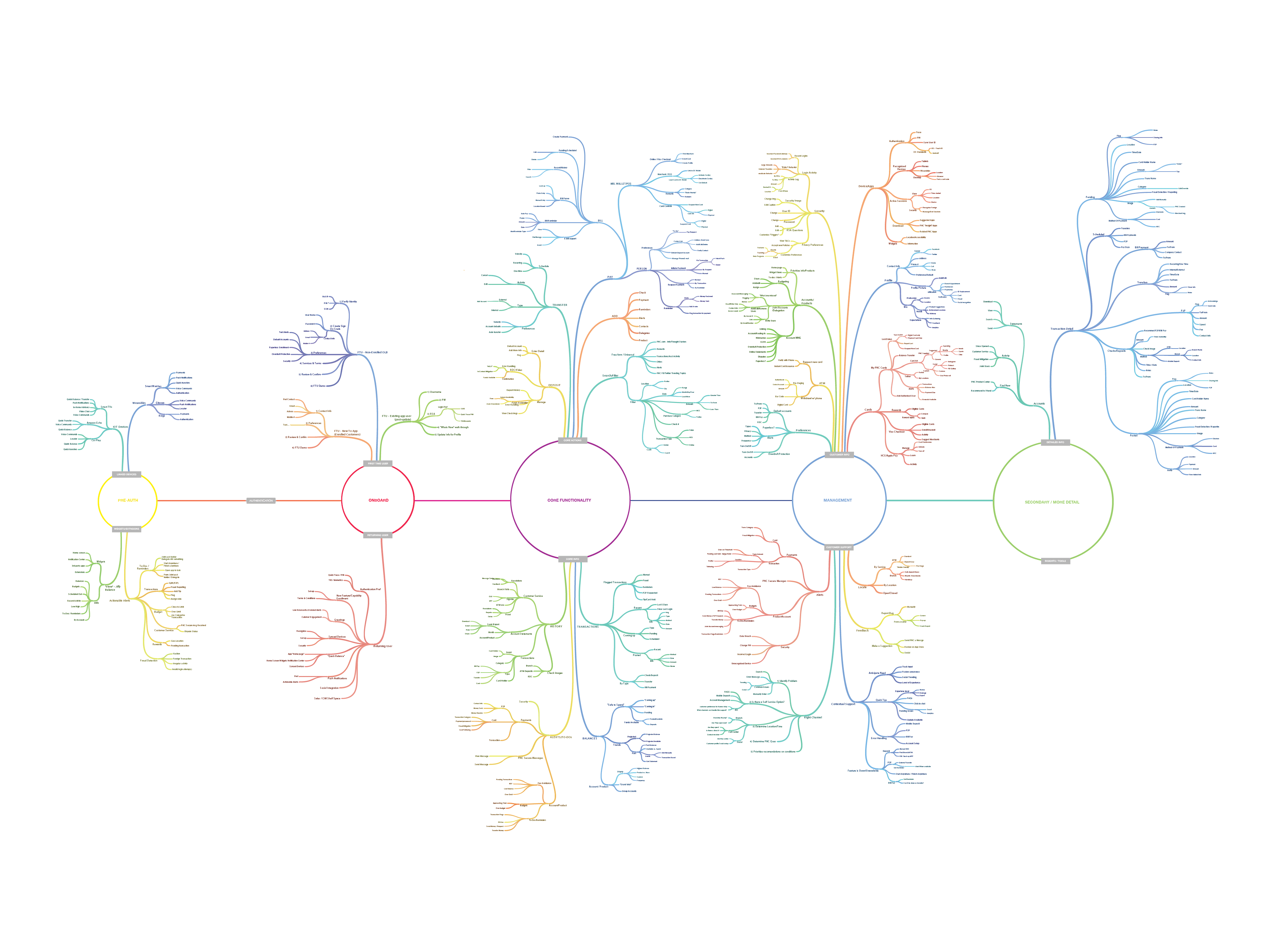
Building a New Navigation System
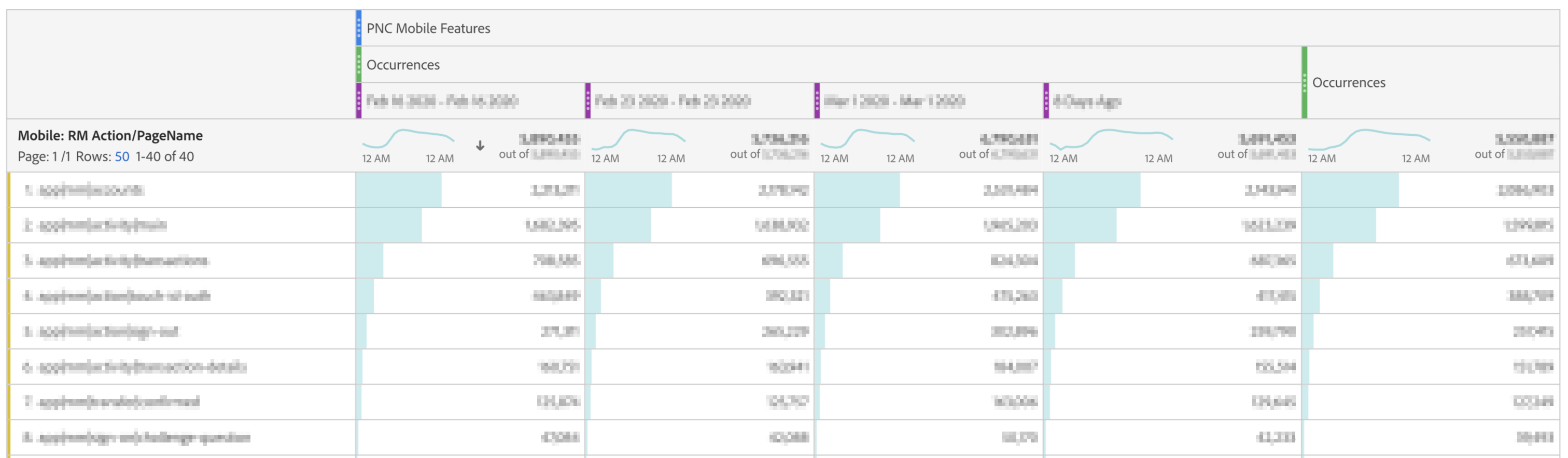
With the refined information architecture in hand, I was able to start working on how users would navigate between features and flows. Here I was able to leverage existing data that we had from our website. Using Adobe Analytics, I was able to determine where most users usually went when they either first entered the app or finished a certain flow.
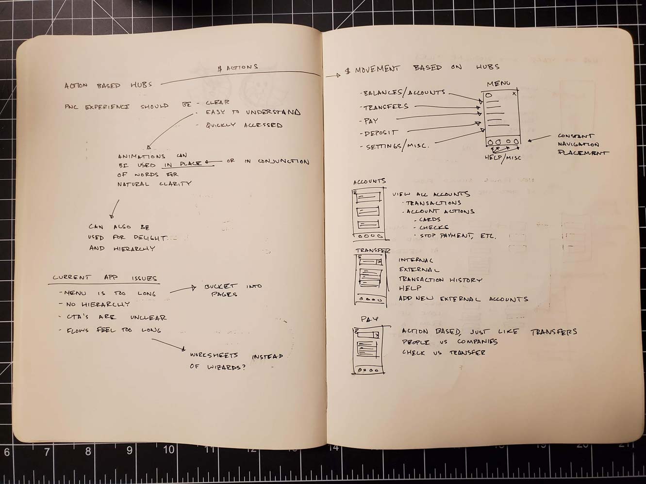
The one thing I did have to look out for was continuity with our old app. Because we're a bank, our users aren't always the most tech savvy. This means that as a designer, I have to foster a safe environment for users consuming our app. I don't want to scare Grandma Rosa in Pittsburgh because suddenly her app is different and she can't find her money anymore. Keeping this in mind, I had to design the new navigation menu and system in a way that connected with the old app. This was done by utilizing a similar hamburger menu, so that returning users would still have an idea of where to go for their general navigation.
The new navigation would be based completely around money movement. Each type of movement would have its own section in the app, and the related features would be bucketed within their sections. This allowed us to fold and organize our features so they weren't statically stacked within the main menu. Users would be able to clearly identify the associated feature and dive in to find their associated tasks.
Prototyping the Experience
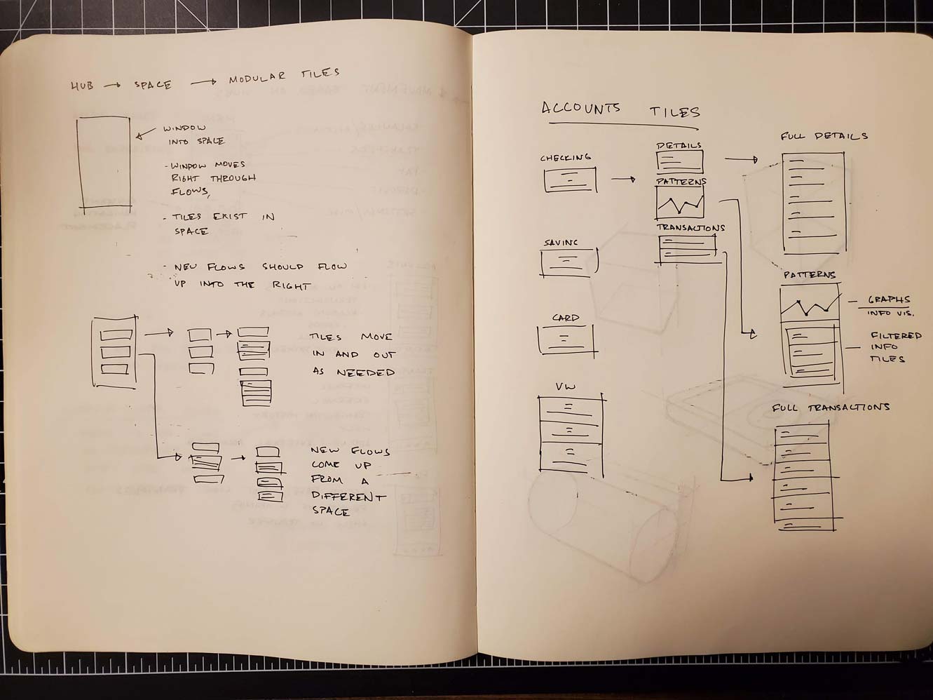
At this point is where I had the most fun in the process. I started whiteboarding out what I wanted to convey to the consumer about PNC. We played with different styles of animation, different design philosophies, and different UX languages. Did we want users to feel delight while going through our app? Or was that frivolous and did we need people to efficiently navigate through their finances. In this phase, I developed around fifteen solidly different prototypes to go into user testing. Through the rounds, the prototypes were whittled down, and I began iterating on the more successful prototypes. In the end we went with a modular tile based system.
The app was designed to let the user plunge into a space "behind" the screen. Tiles of relevant information would weave in and out of the scope of the screen and let the user navigate through space in that way. This served to do a couple things for us as well:
- It let the design be consistent throughout the app via tappable tiles.
- The design language was sparse, so a user would be able to intuitively understand each page faster.
- Developers were able to create multiple use assets instead of rebuilding every page individually.
Here are some quick prototypes of how we envisioned tiles moving.


Visual Design
Here I tried bringing the designs to life by adding colors to each section. Each color would signify that the user was in a different section associated to a feature. Because the tile based design was so uniform, I wanted color to bring an extra layer of clarity so users would intuitively know where they were.
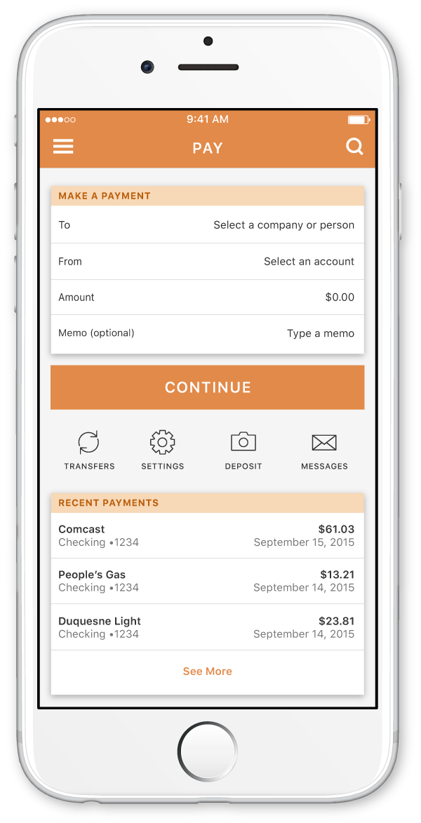
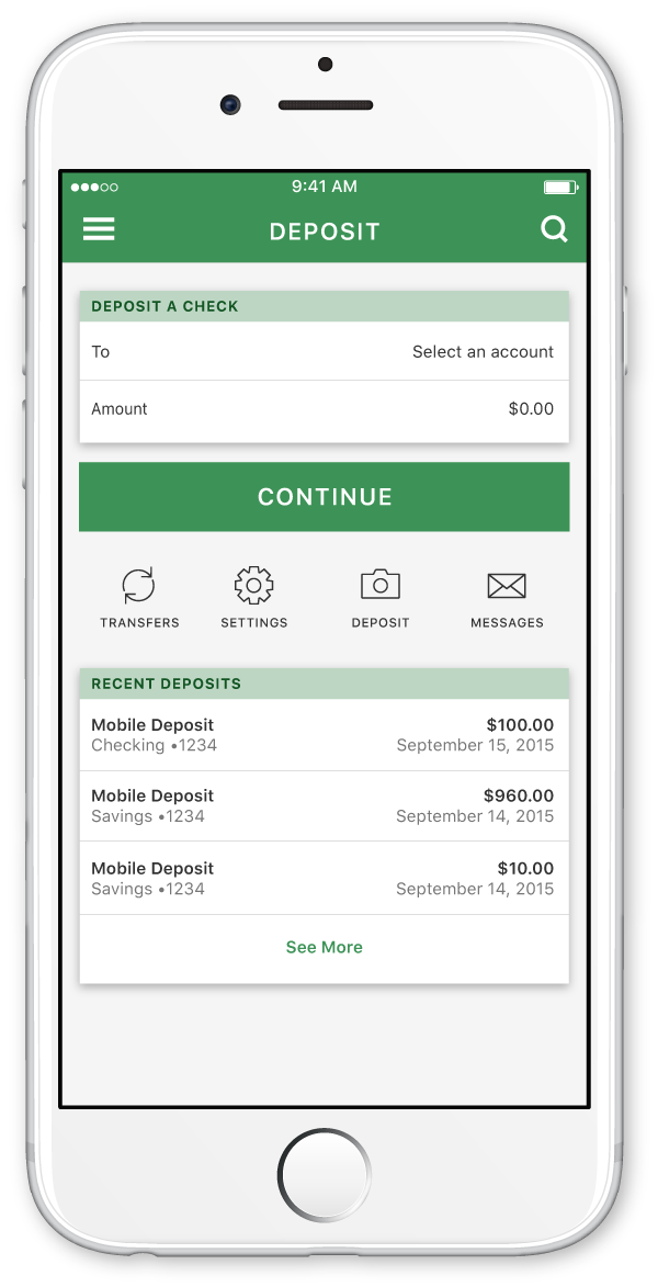
We soon realized that the colors that I had chosen weren't accessible for visually impaired users. The colors weren't WCAG 2.0 compliant. We ended up having to throw out almost all of the colors I had chosen in favor of higher contrast designs. In their place, we decided to use the two main brand colors of PNC: orange and blue. This way we could maintain the PNC brand and also let colors act as interactable elements. Orange was loud and used for direct call-to-action buttons. Blue was more subdued and signified that an element was tappable. Tiles would rise and fall on the page to show they could be interacted with. This gave way to the current app design as it is now.
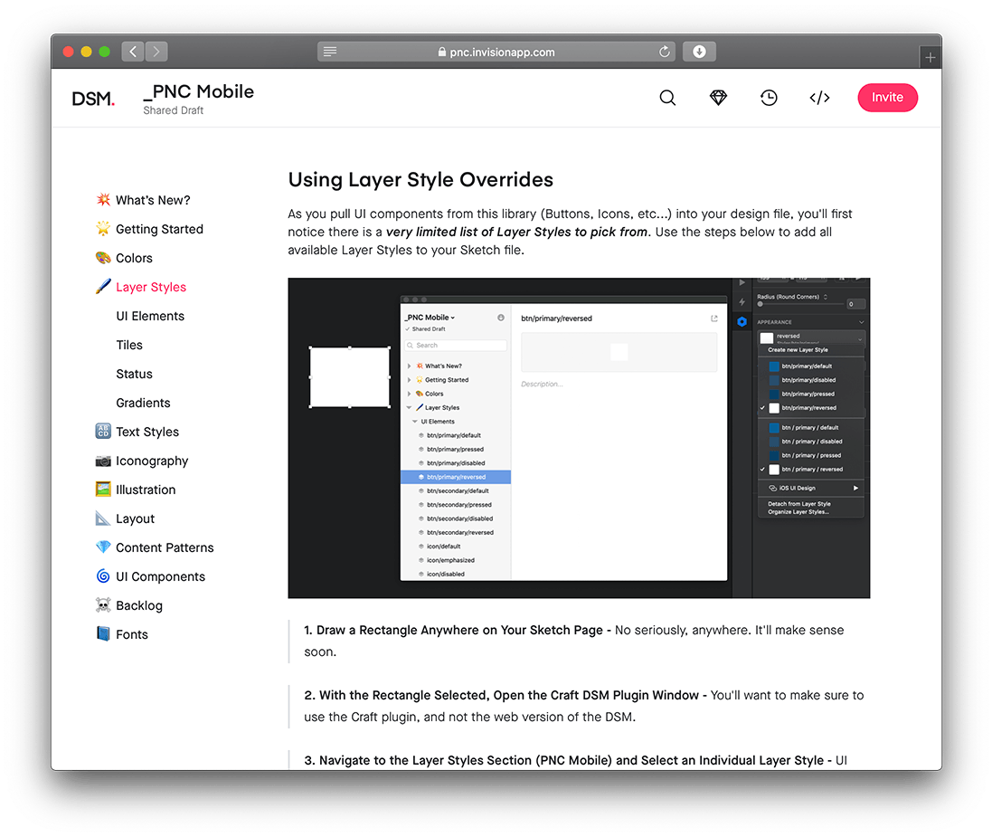
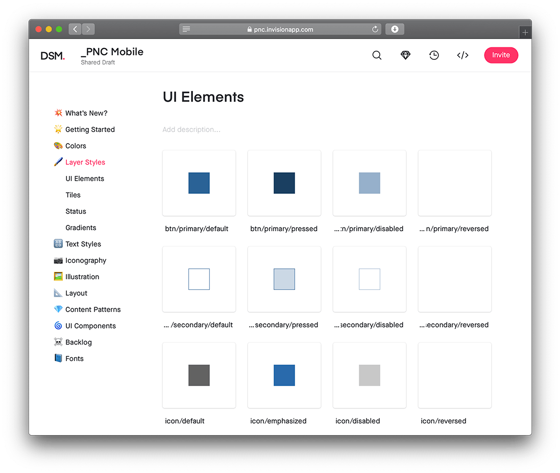
Creating a Design System
Currently, we are working on a way to speed up the design process at PNC using the Invision Design System's Manager. This has taken the form of a design library. The library let's us create components only once, and then be able to use them flexibly in any of our designs. More importantly, it let's developers use an inspect tool to see all the details they need (eg. margins, paddings, text sizes, color codes). Because the design system lives on Invision's server, we can edit it whenever we want, and it will be updated for all of the developers as well. We're not quite finished yet, but it has proven to be invaluable for the team.
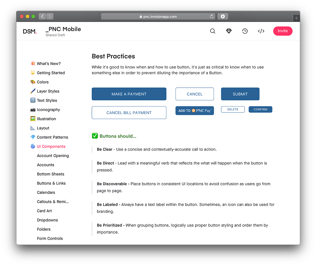
Practical Design | Control Hub
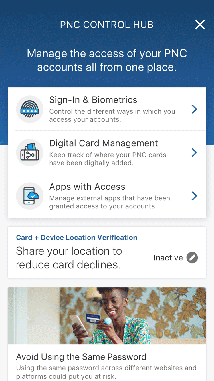
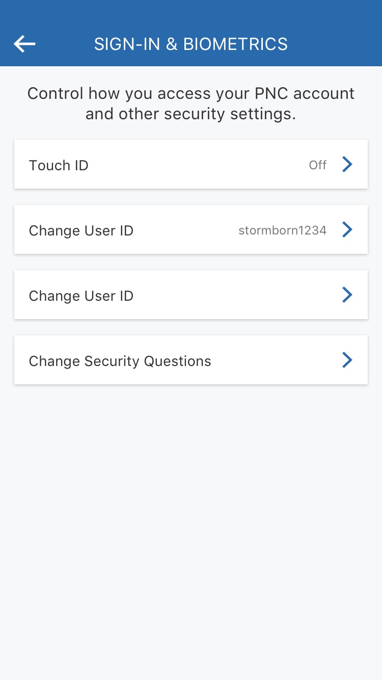
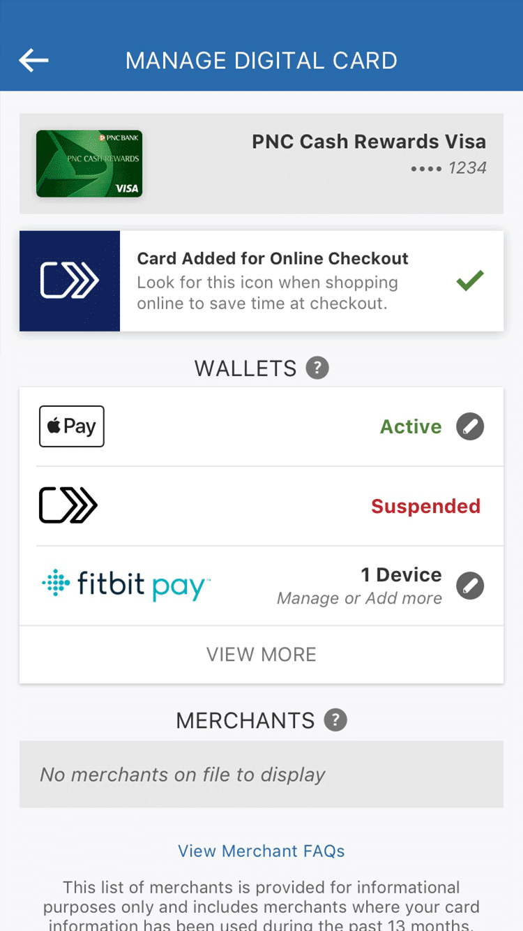
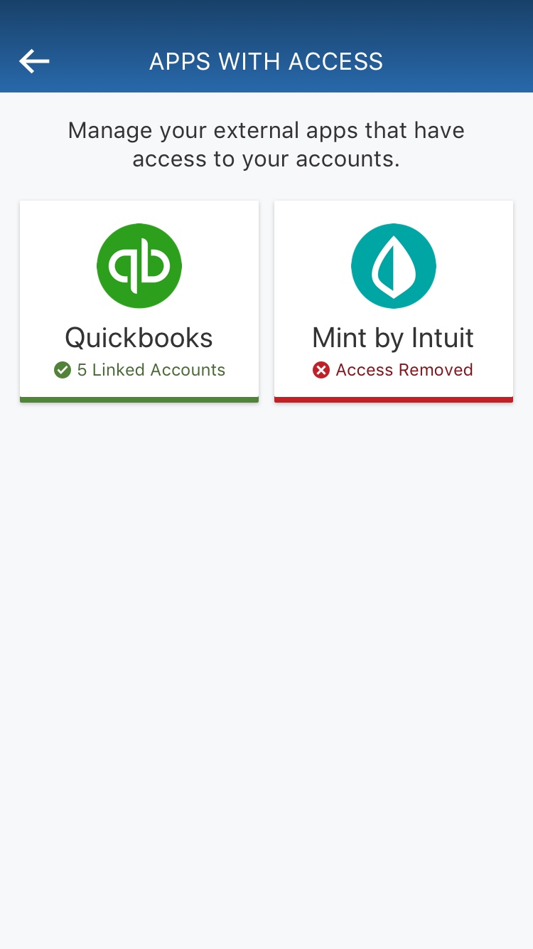
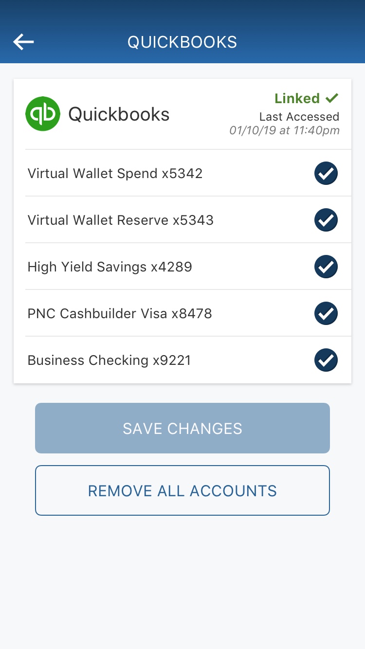
In September 2017, Equifax was breached. Around 150 million people's personal information was leaked to hackers. Millions of people were opened up to identity theft, fraud, and other expenses. As a direct response to that, PNC started working on Control Hub. Control Hub allows users to see everything related to how they are sharing their financial information. This includes services like Netflix, Paypal, Grubhub - Control Hub will show users where exactly their accounts are linked. This gives users ease of mind and let's them feel confident that their information is safe with PNC.
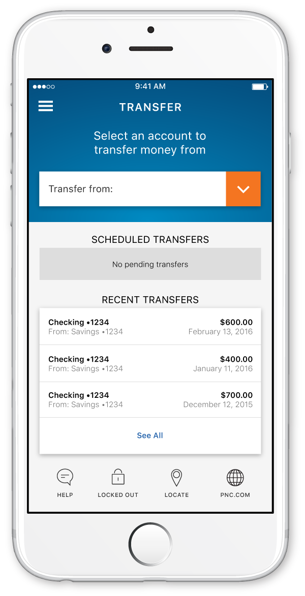
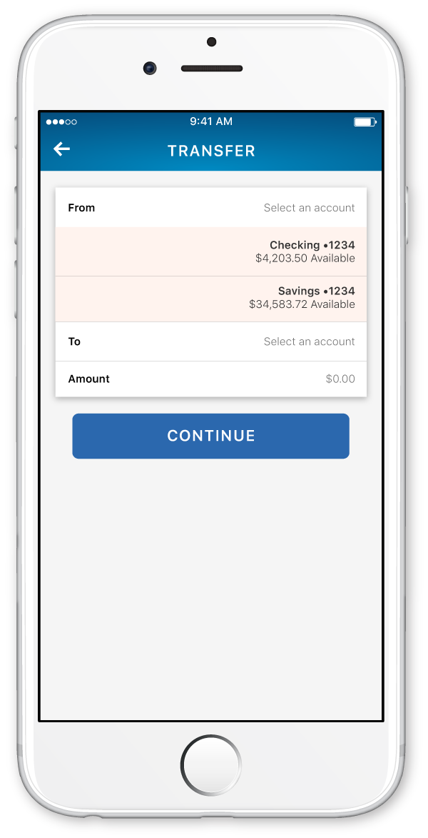
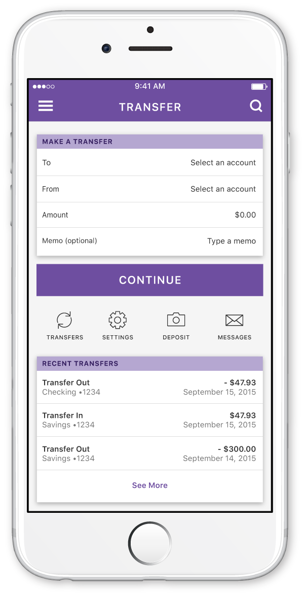
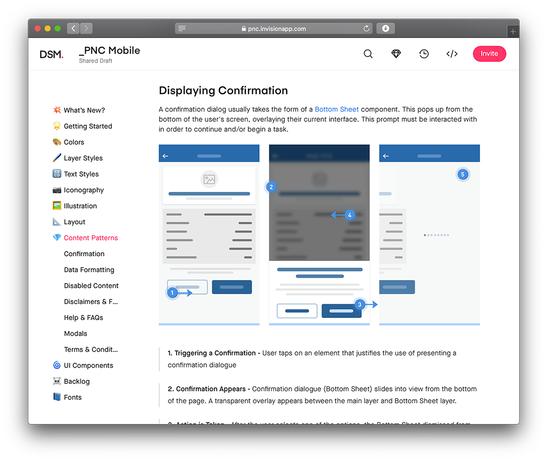
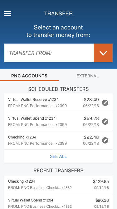
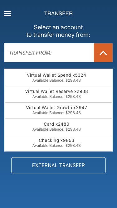
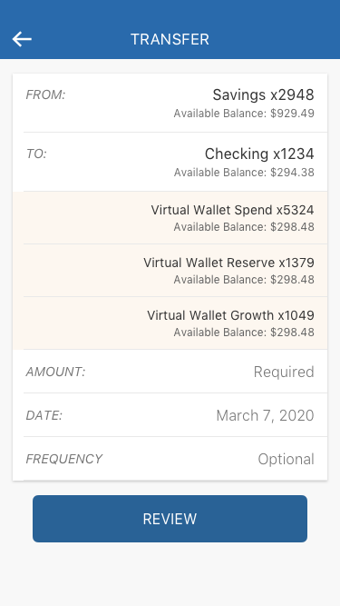
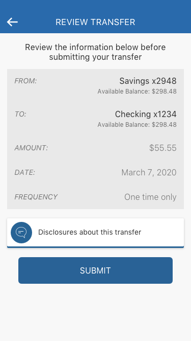
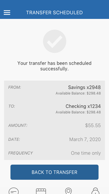
Practical Design | Making a Transfer
The following screens show how a user moves through the process of making a transfer. The user will start on the transfer hub page and tap the expanded header. From there they choose an account to transfer from. They are then prompted to fill out a worksheet with the relevant items. Once they tap the review button, the background of the worksheet changes to grey indicate that the user is to double check the data. Relevant information tiles animate in so users are able to find help if they need it. Once they find everything acceptable and hit submit, the user will be taken to a confirmation screen that shows a receipt of their details. From here users are prompted to either go back to the transfer hub or tap the main menu to perform another function.
Improvements for the Future
The way that the animations behave within the app are significantly different than what I had originally mocked up. I am trying to figure out a better way of explaining to our developers how I want certain things to behave; motioning with hand gestures and sound effects only takes a person so far.
Craft of the actual code is a little bit off as well. Because I had to design using percentages, certain elements are slightly off from what I had mocked up resulting in a slightly different feel when using the app. Certain drop shadows aren't represented the way that I had anticipated as well. There are a significant number of small changes that I would like to make, but must move past to constantly pump out new features.
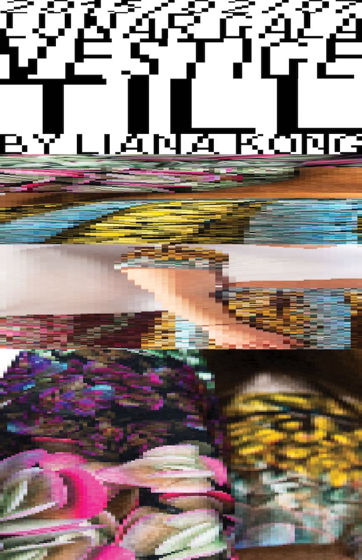
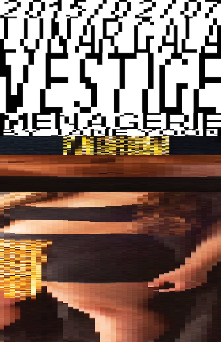
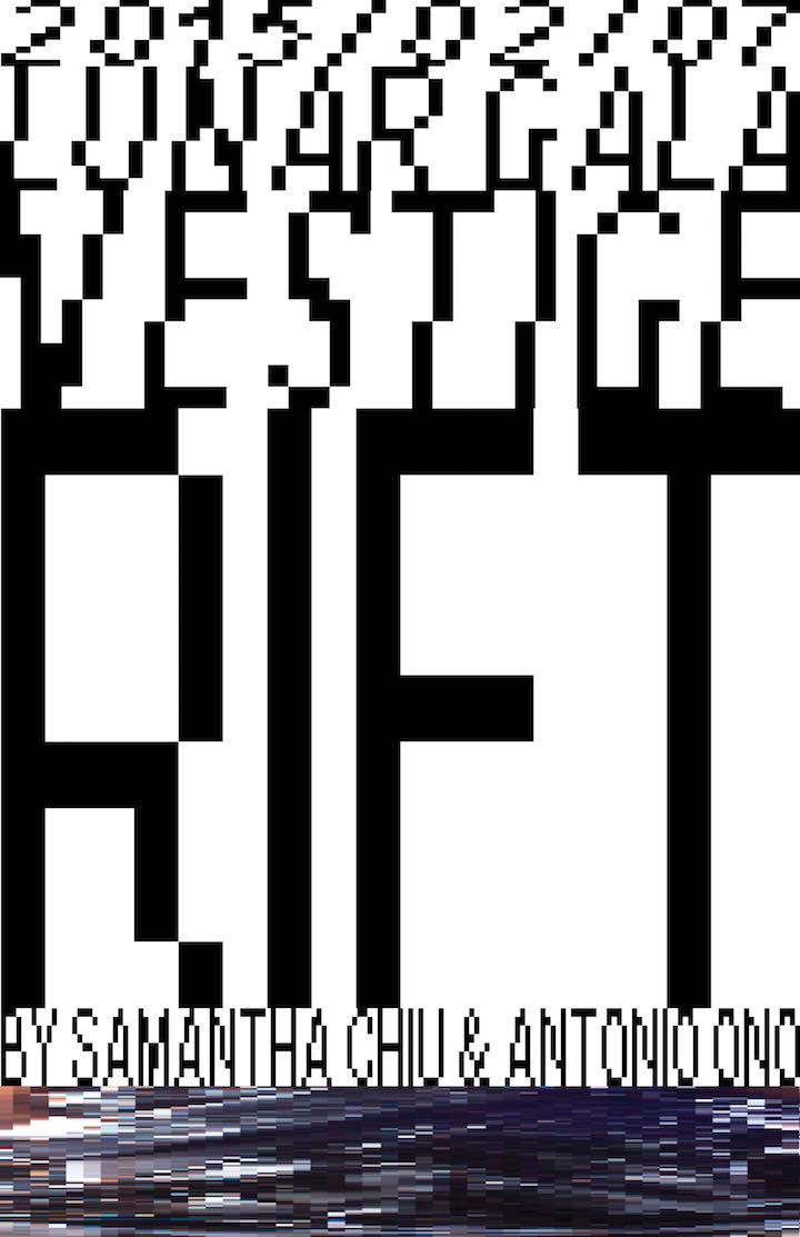
Lunar Gala | Vestige
Lunar Gala is a student-run fashion that is hosted annually by Carnegie Mellon University. I worked with Nio Ono, Zai Aliyu and Daniel Kim as designers and Salem Hilal as developer.
You can watch the quick demo below. I'd recommend fullscreening it for the full experience.
Developing the concept
Initial brainstorming was all about the relationship between the fashion show as an entity and the audience as a participant. We wanted to play with the idea that the show was an experience that people would come to in order to be cleansed from the struggles of school and daily life.
The idea of screaming into a pillow or throwing a tantrum came up several times. Because the culture at Carnegie Mellon is extremely stress based, we hypothesized that having an event to let it all out would be refreshing for the students. A sense of visual and data overload has a similar effect where the brain basically shuts off and becomes numb. We strove to achieve this with a variety of different design techniques.
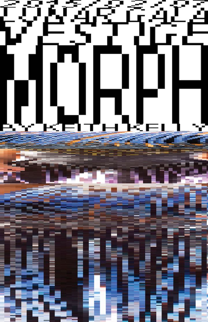
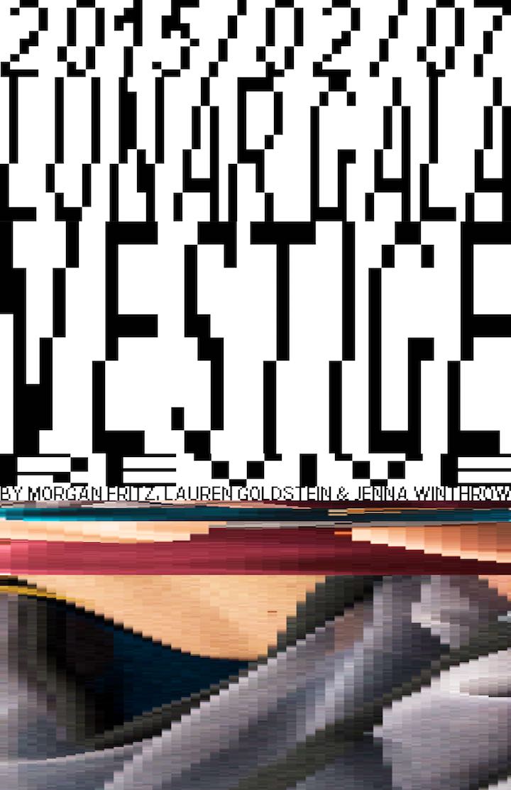
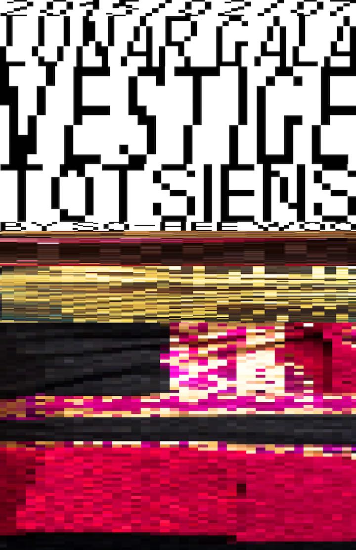
We chose to use extremely bright graphics and animations to really overload viewers. They were never quite allowed to see what the image fully was; they only received enough information to tease at extremely uncomfortable images. Images were then stretched and pixelated to further frustrate viewers and (hopefully) remind them of their slow-as-mud DSL internet growing up. Negative space was completely abolished within our compositions. The purpose was to instill a sense of claustrophobia; we didn't want our viewers to be able to breathe.
Designing the website
The website was perhaps the most difficult piece of the branding effort to create. There were so many different animations and interactions that we wanted to incorporate, but ultimately had to choose only a few because of technological limitations. A lot of our visual and interaction styles came from the process of designing the website.
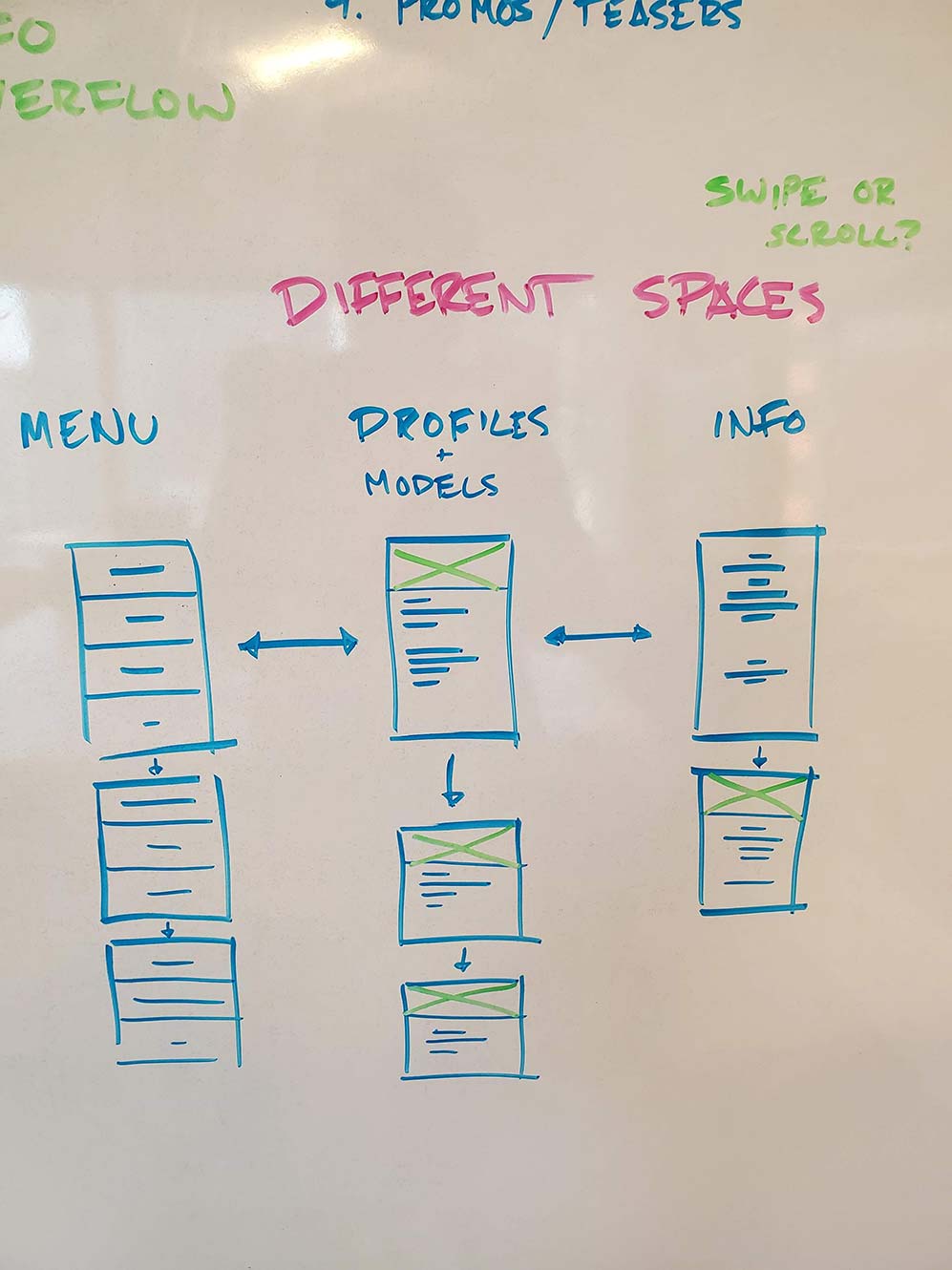
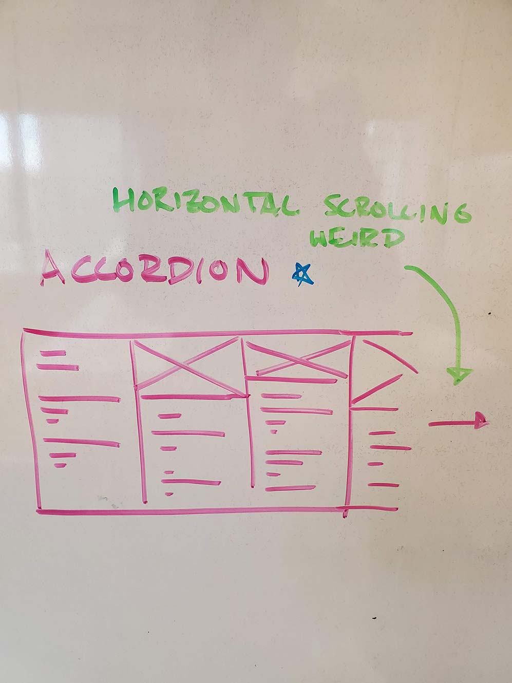
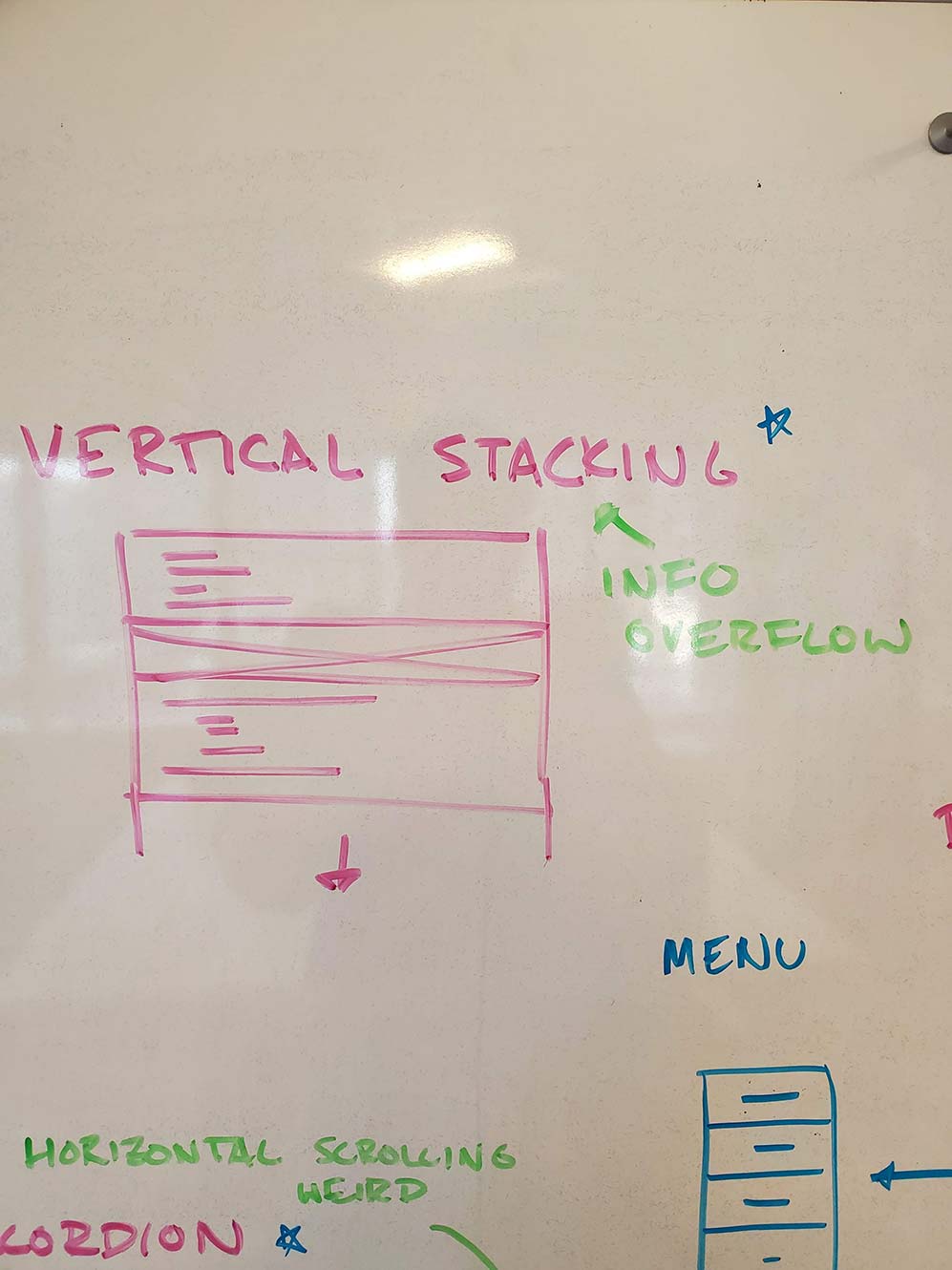
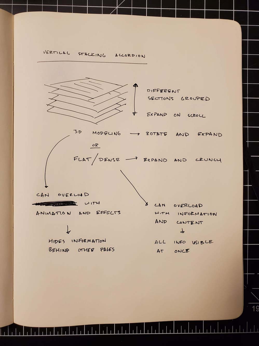
We incorporated large horizontal elements stacked on top of each other to create a sort of drowning effect when viewed all at once. We crafted the website so that every section of the entire site was visible at all times. An accordion effect was designed to make this happen. Sections' overall colors were squished until they were mere pixels high and crammed at the vertical edges of the website. This created the effect that viewers would be drowning in information overload.
We also had to make sure that the website was still interactable. To make sure users could get to appropriate areas, each section was turned into a link. When clicked, the section would expand fully to show the details that the user was looking for. The make sure that users could find each section, we added logic that would expand each header to a legible size when the user shook their mouse on the website.
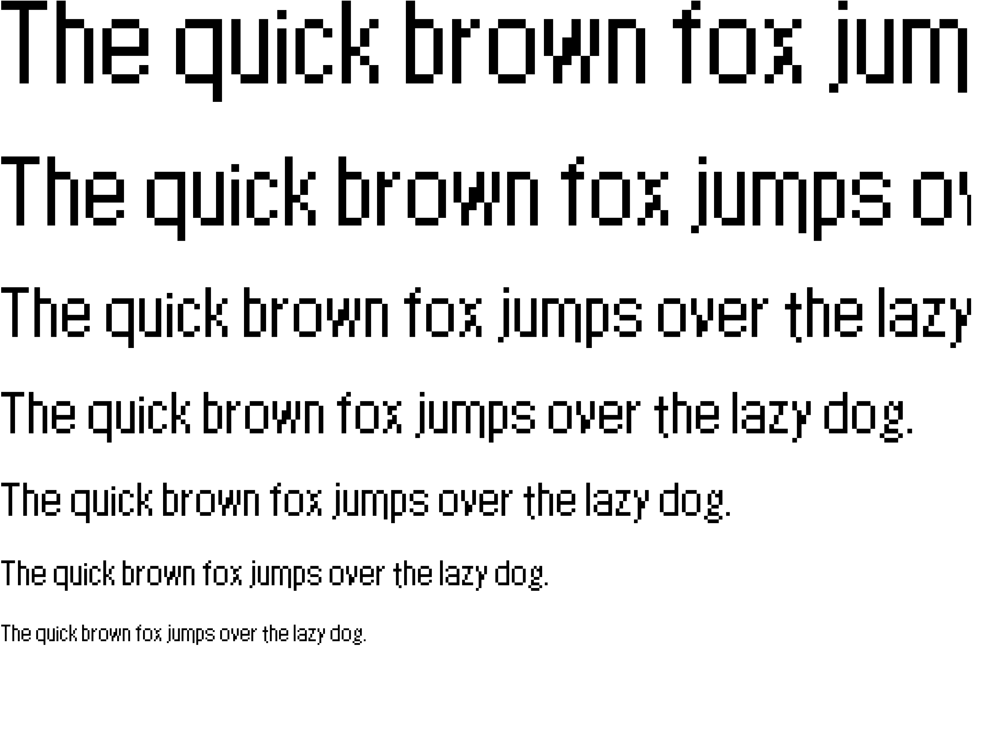
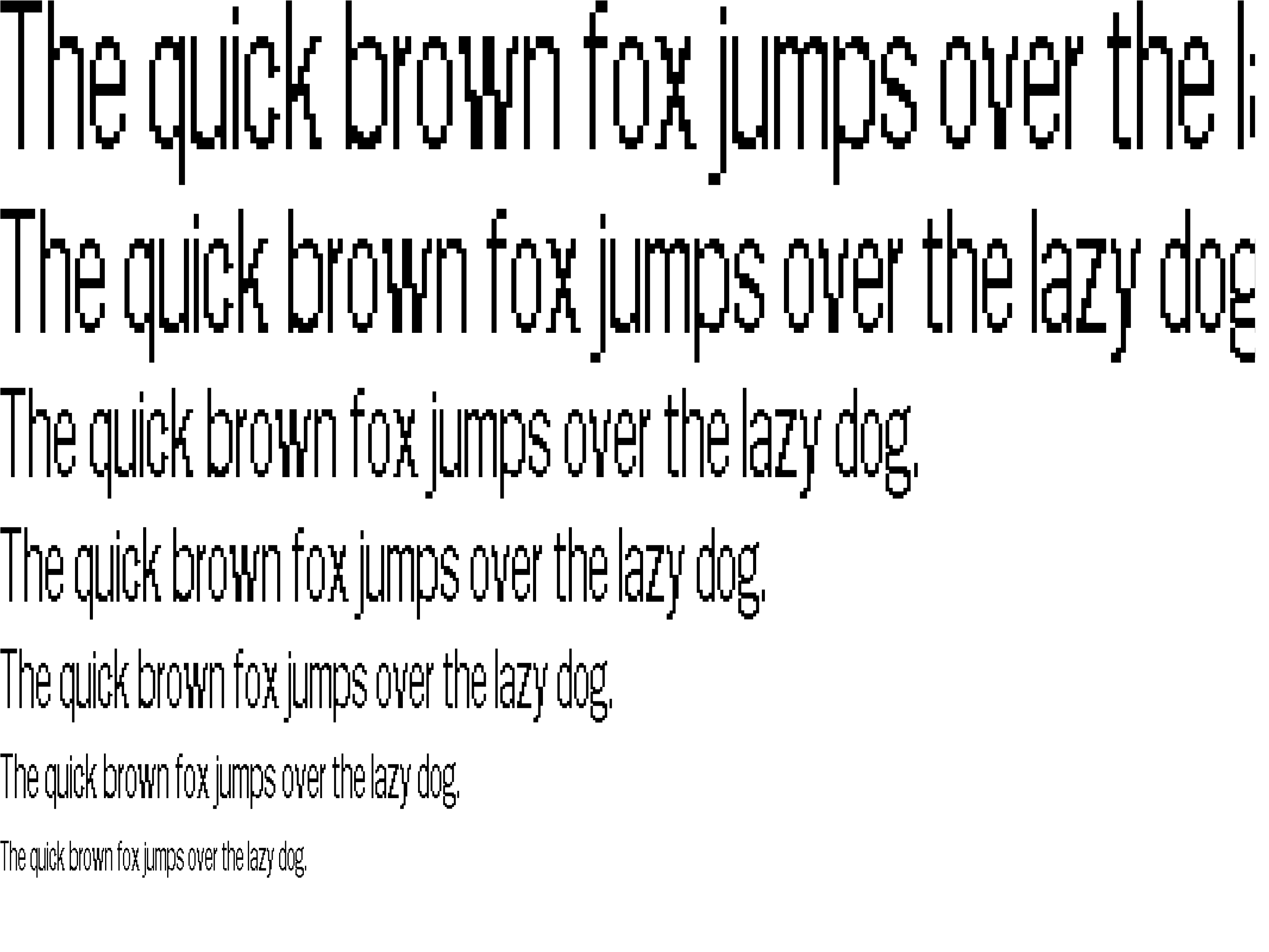
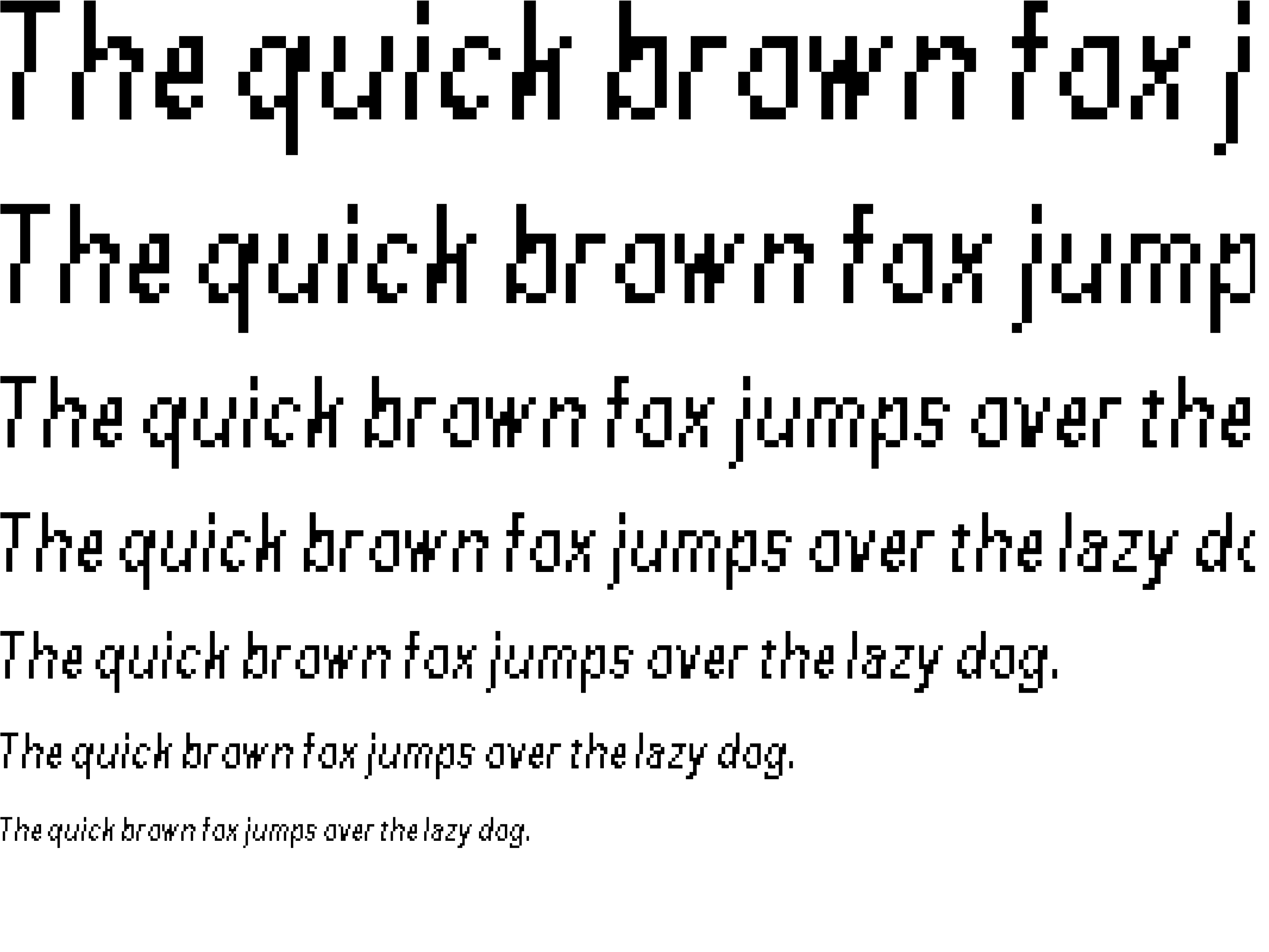
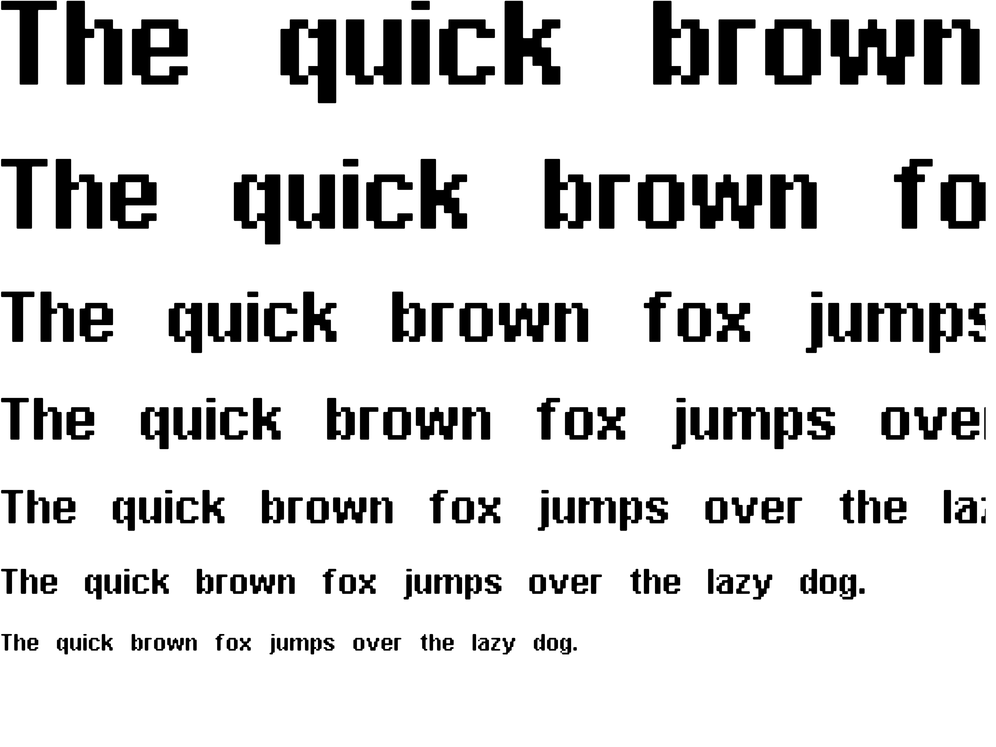
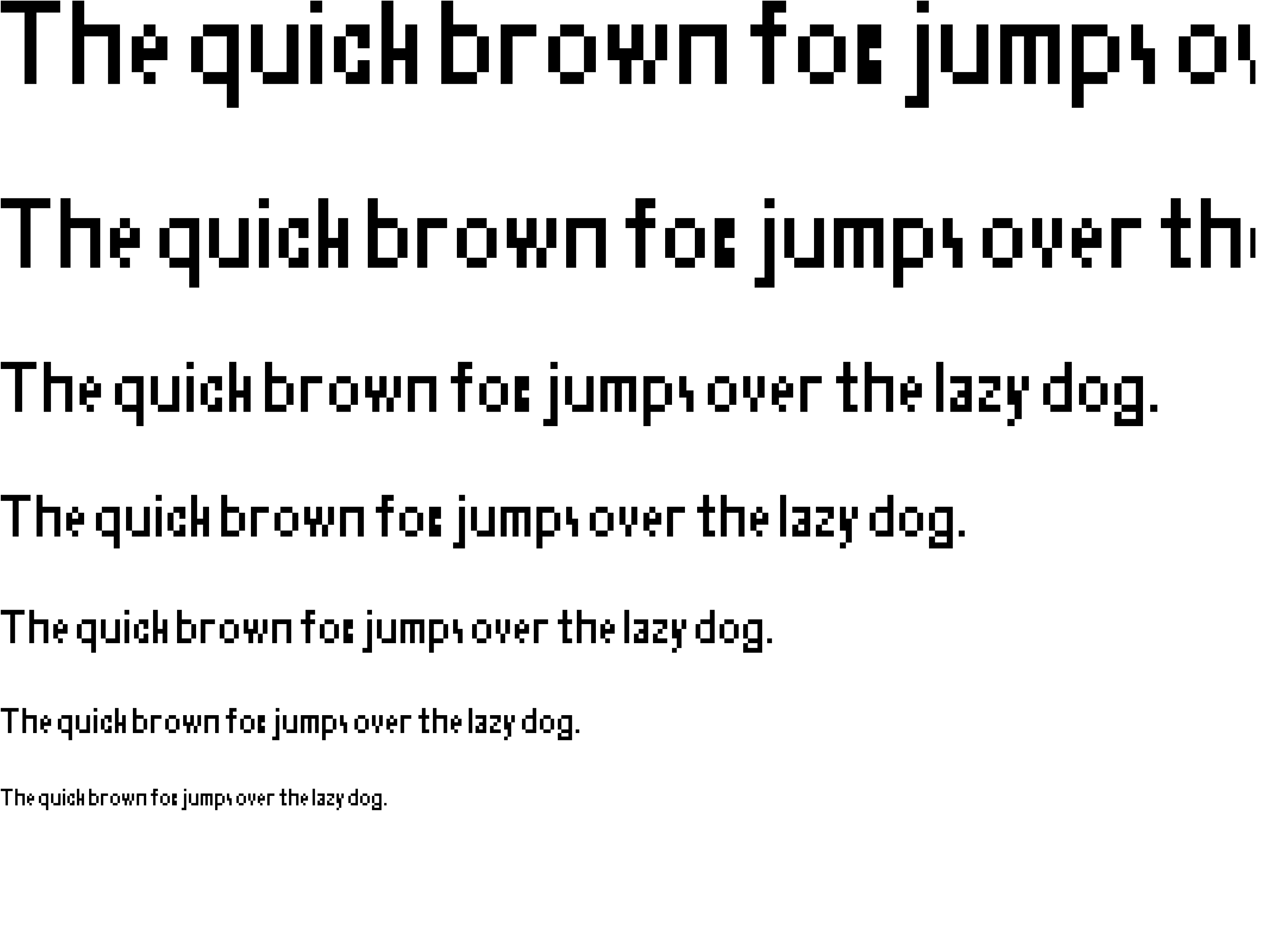
Designing the font
We ran into a challenge with our typography where nothing seemed to fit our distasteful aesthetic. We decided that we would have to design our own font to make things work. The biggest challenge was trying to balance legibility with chaos. We wanted everything to readable, but the viewers would have to put in more brain power than usual to understand it. We went with our pixelated style to add enough noise to disrupt the brain, but kept the letterforms mostly clear so viewers could still read the text.
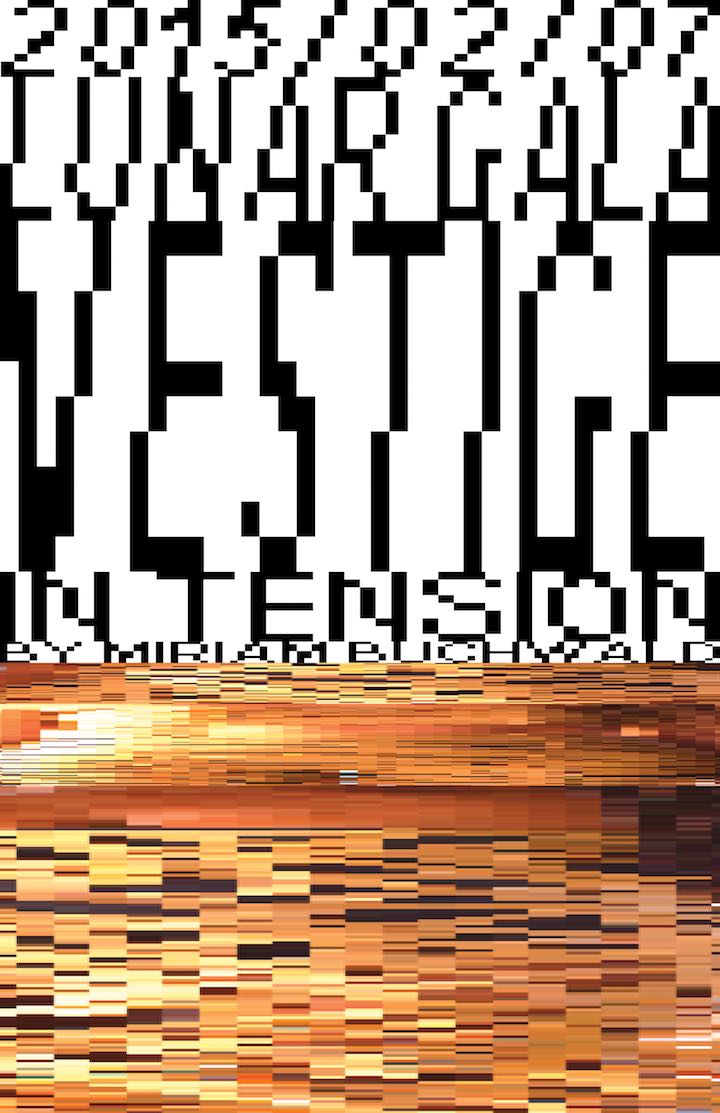
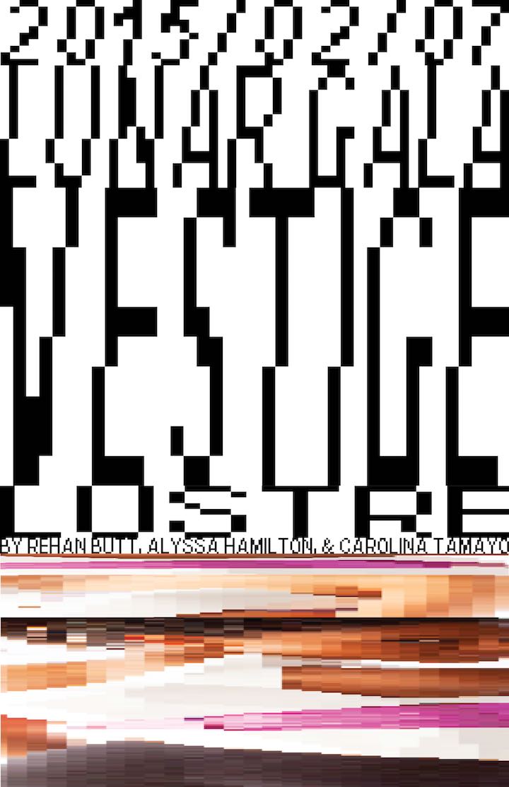
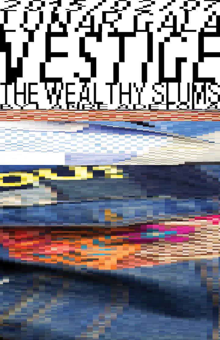
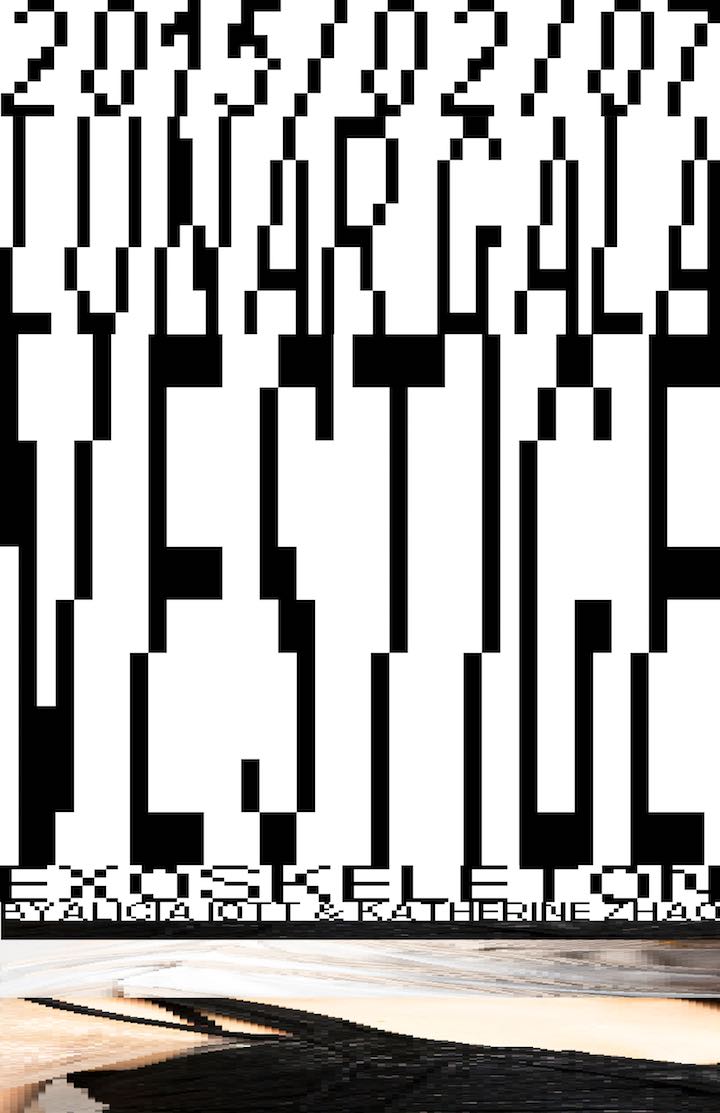
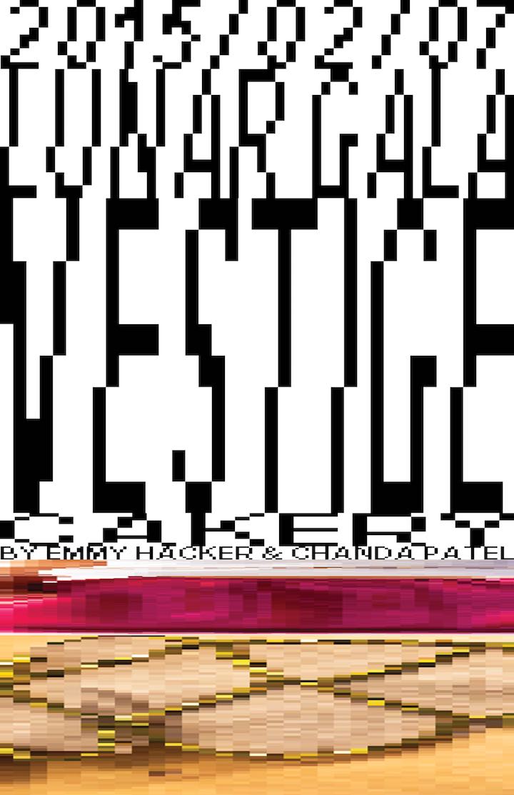
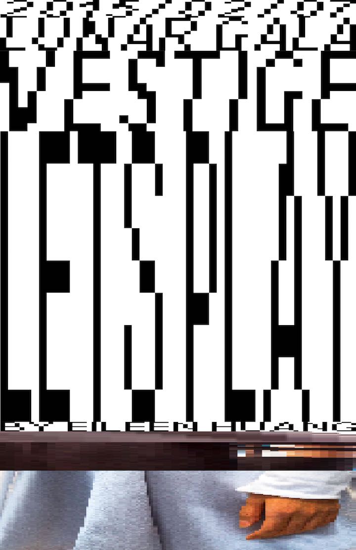
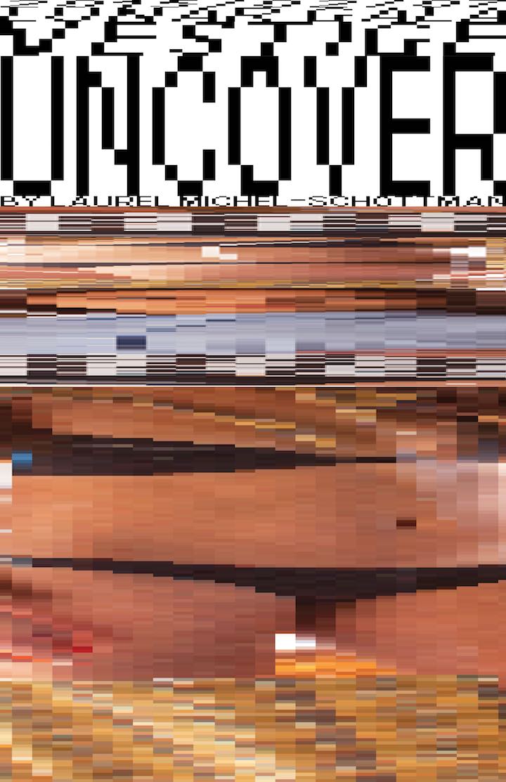
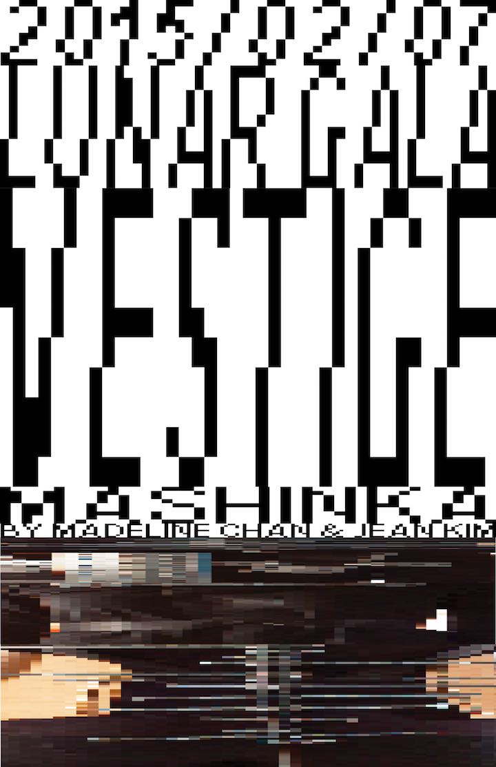
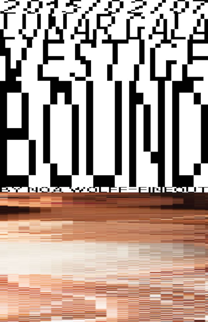
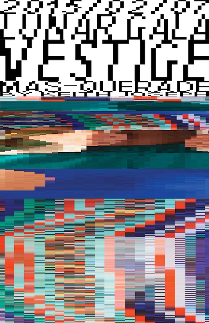
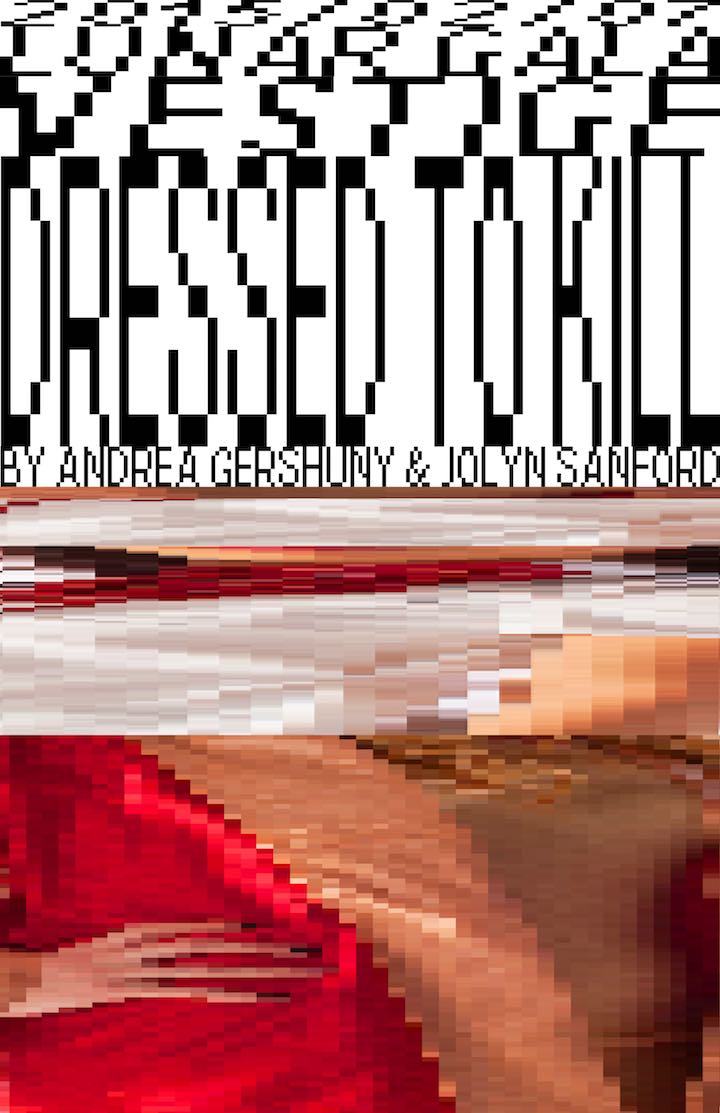
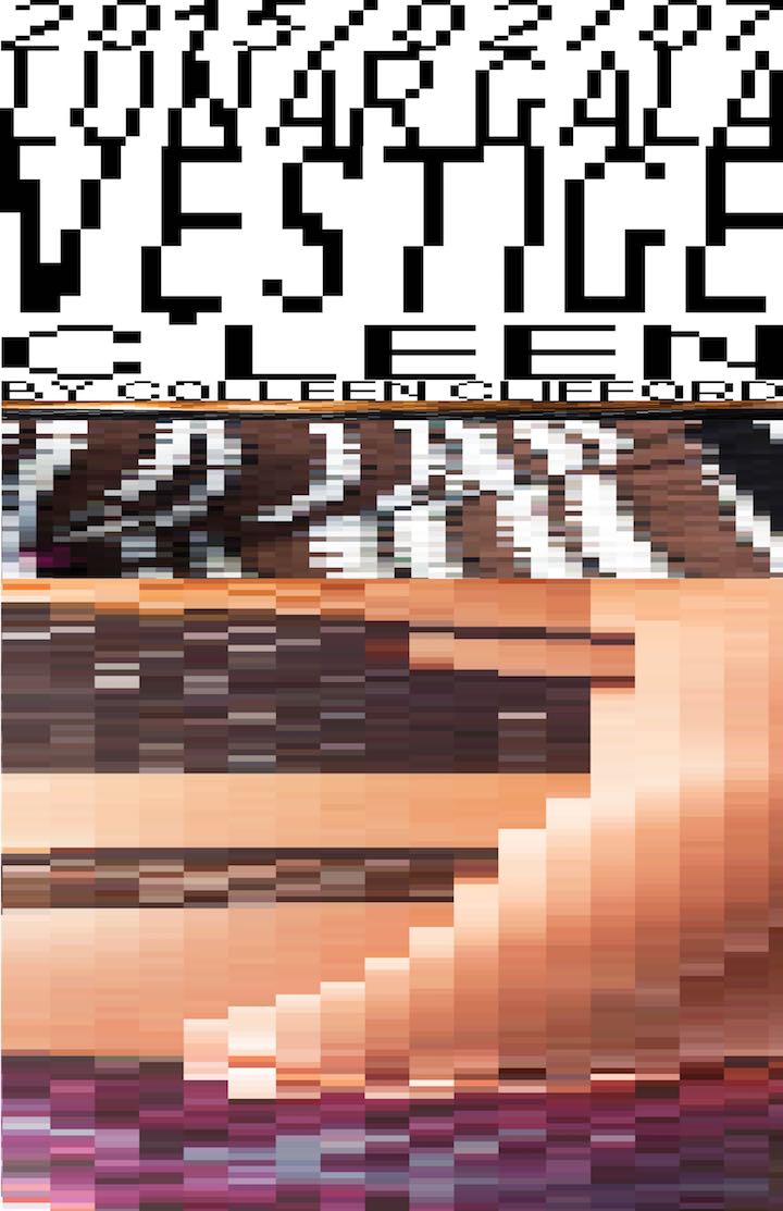
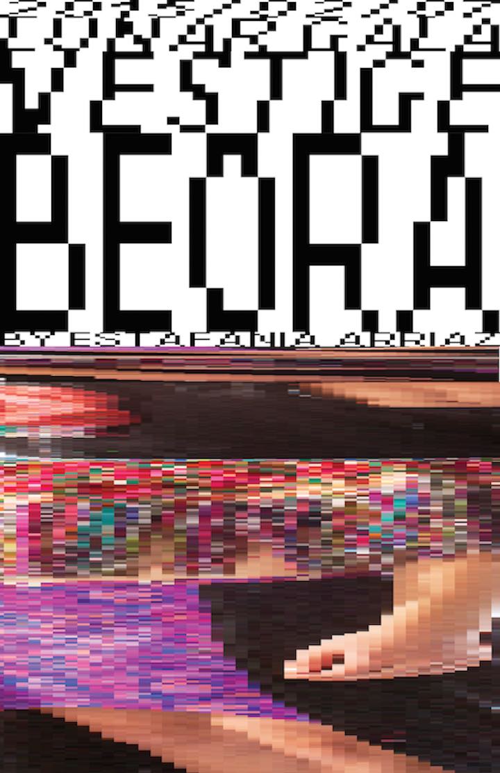
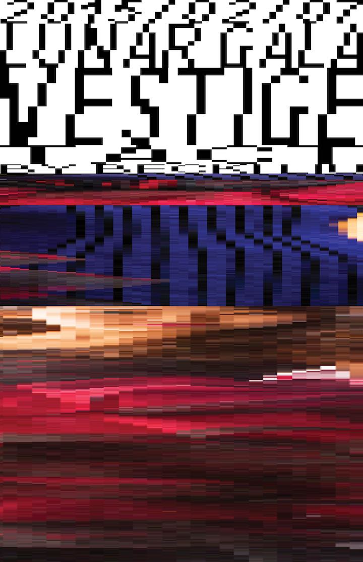
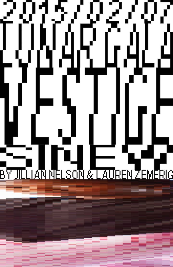
Creating the posters
We created posters to advertise each fashion line. With the posters, we used the same idea of horizontal stacking elements that we had designed the website with. This would hopefully give a small taste of what the full experience at the show would be.
Closing thoughts
Vestige was an exercise in getting out my established aesthetic style and learning to operate in new design schemas. We worked from the ground up to not necessarily follow tradition UI/UX guidelines and rules, but to break down why each of them were in place to begin with. We could then decide whether or not they matched what we were trying to do achieve with Vestige. Because the point of Vestige wasn't to make the experience easy and effortless for users, we found that we consistently had to break the rules and create new ones specifically for this brand identity. It helped me grow as a designer and have a deeper understanding of tailoring the experience instead of blindly following presets because they were "right".
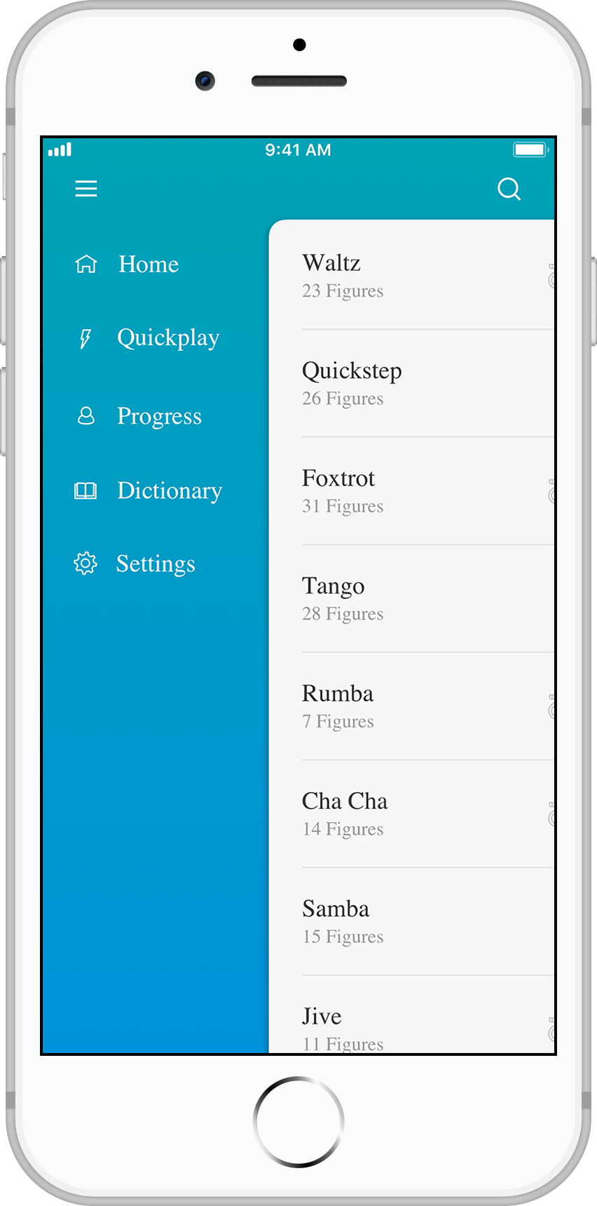
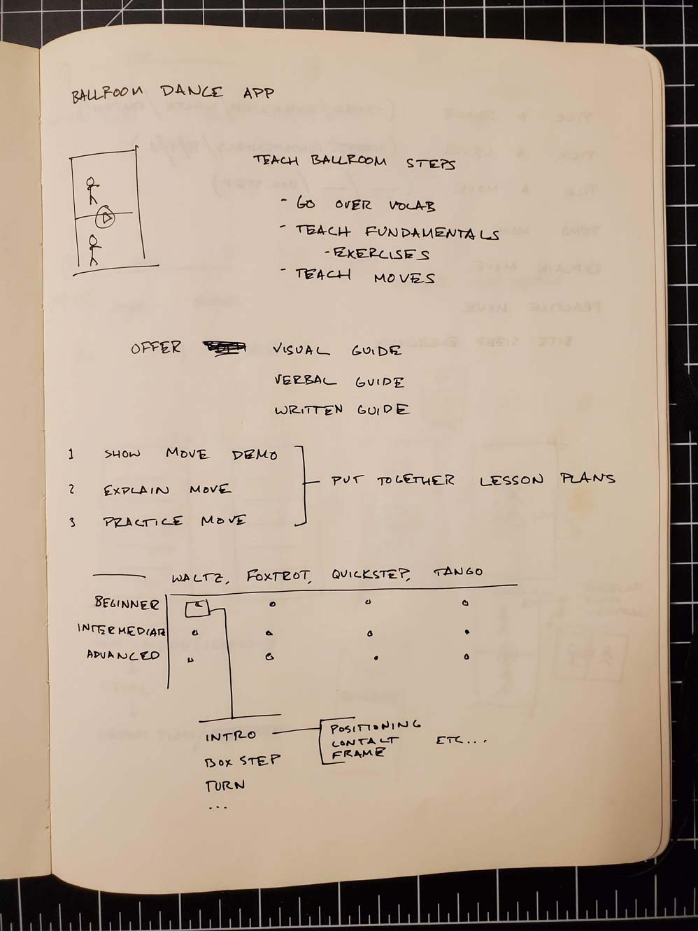
Ballroom
Ballroom is an app designed to let beginner dancers learn different dance steps. The app contains a guide for each dance step within the ballroom syllabus, and it lets users practice by following along with the app in-hand.
You can play with the Invision prototype here.
Background
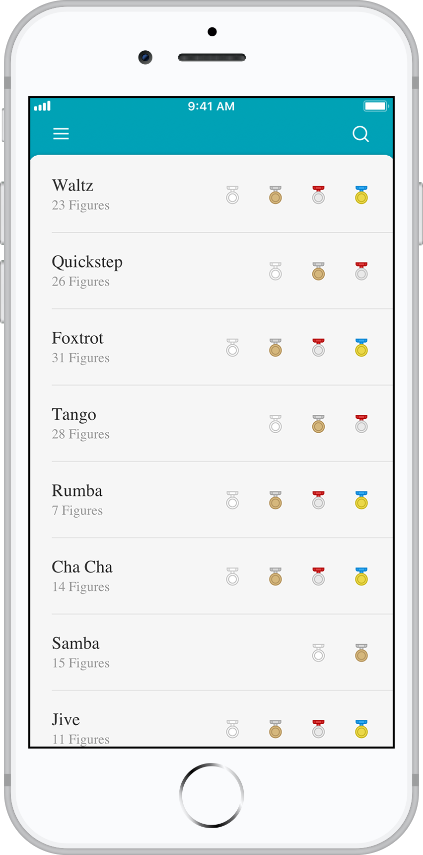
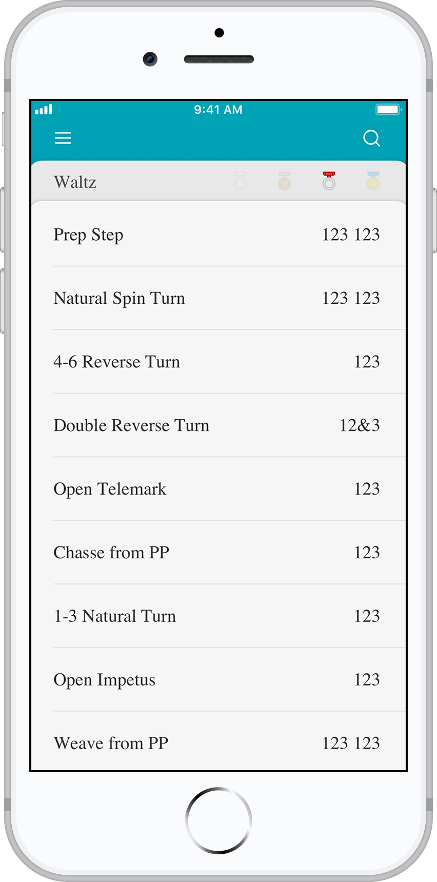
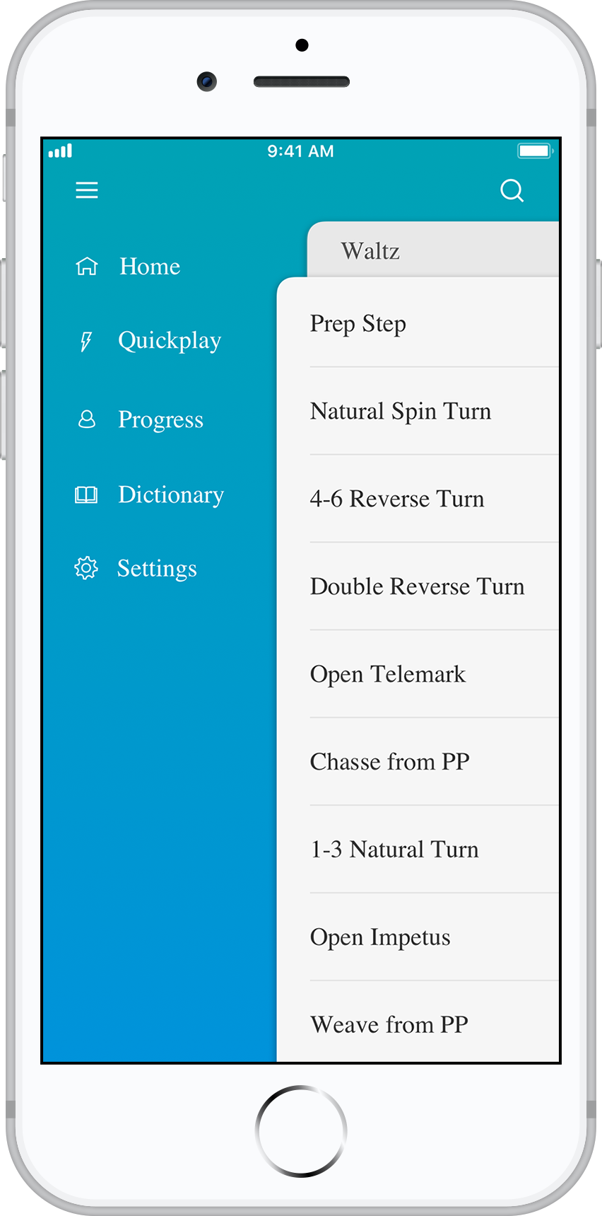
To compete in ballroom, it's necessary to learn several different dance genres. Within these genres, dancers must go through four different levels of proficiency before before he or she can start freely dancing. These levels are: Newcomer, Bronze, Silver, and Gold. Each of these levels has a syllabus with specific figures (or dance moves) to go along with it.
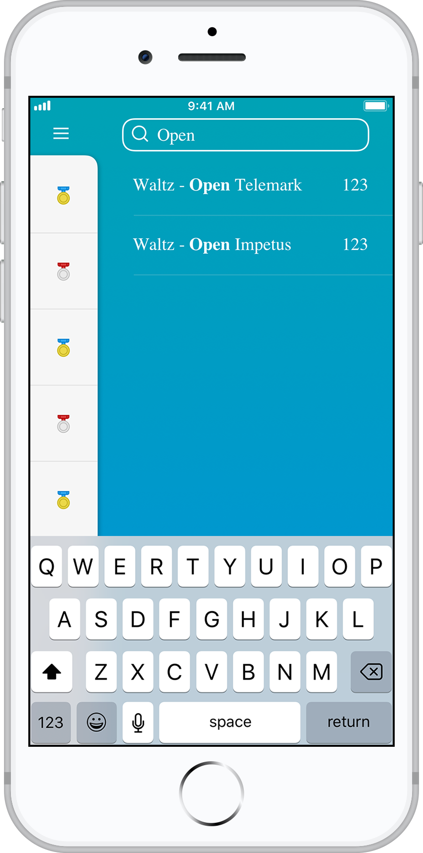
The Ballroom App consolidates these figures and puts them in easy-to-digest routines so that a dancer can learn both the figure itself, and how it connects with other figures. These routines are accessed by tapping the medal icons in the home page. Each medal will take the dancer to the corresponding routine.
Practice Makes Perfect
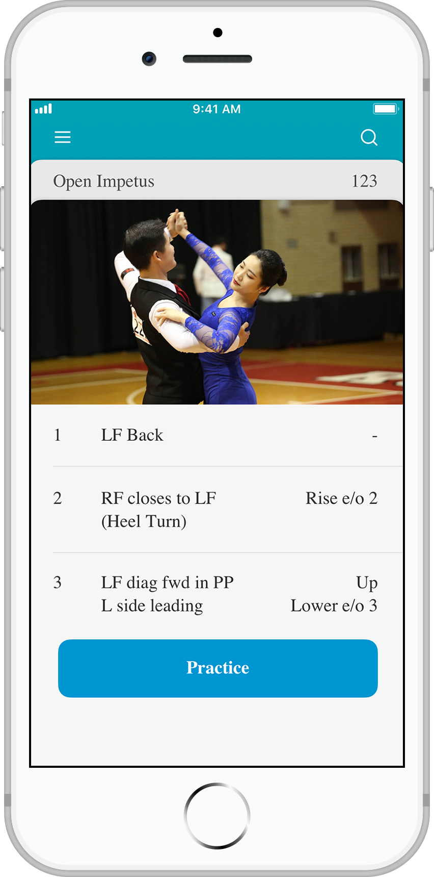
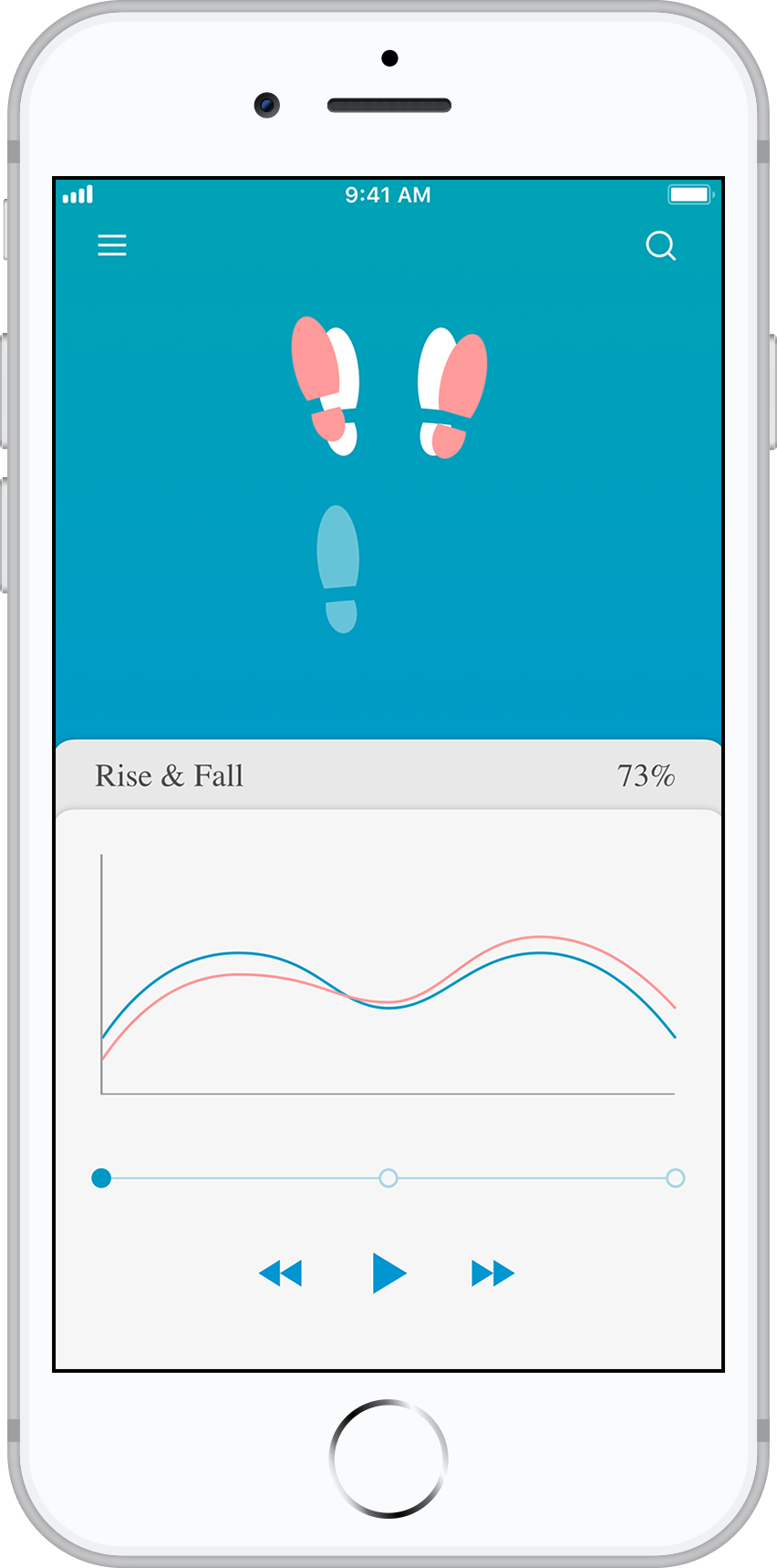
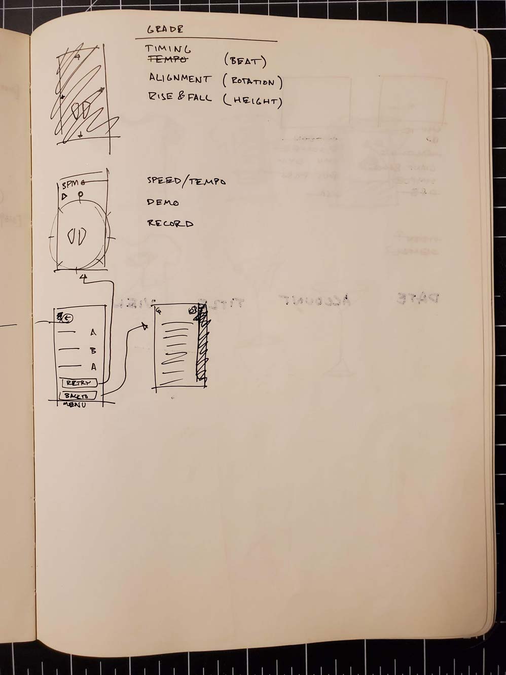
The App shows a visual demonstration of the figure, as well as a written guide under it so dancers can follow along as they read. Once they're comfortable with the way that it looks, they are able to tap the Practice button and be taken to a step by step guide.
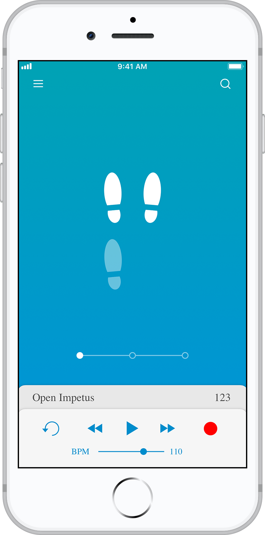
In the practice screen, dancers are able to see how feet move in each count. If the demo is moving to fast, they can slow it down using the tempo gauge at the bottom. If they'd like to pause and move through it at their own pace, they are free to do that as well. Once they've gotten a hang of it, they can tap the record button and follow along with their own feet.
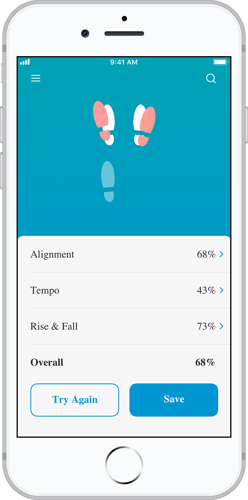
After the dancer has finished recording, the app will grade them on their performance. Using the phone's gyroscope, the app should be able to calculate the dancers rise and fall (height), aligment (rotation), and tempo (speed). In the report card screen, dancers will be able to see how they match up to a professional dancer's form and technique.
Interaction Design
For the Ballroom App, I chose to use a card based design on top of a gradient background. Users are able to flip through information as new cards appear. To go back, a user simply has to tap on the previous card that acts as both a back button and a header. Because the app is relatively lightweight, I was free to do a more simple navigation system relying mostly on visual and animate cues to guide the user.
The practice screen was probably the most interaction heavy piece of the app. The main challenge was to figure out how to list the buttons in an easily digestible way without cluttering the app and taking focus from the main point: the feet.
The Process Behind the Design
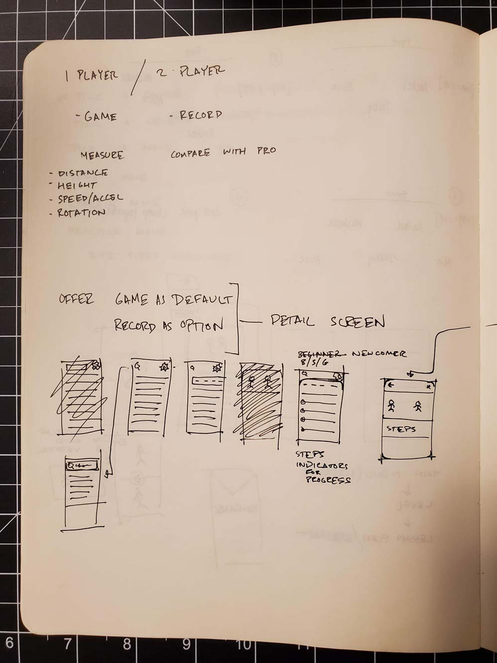
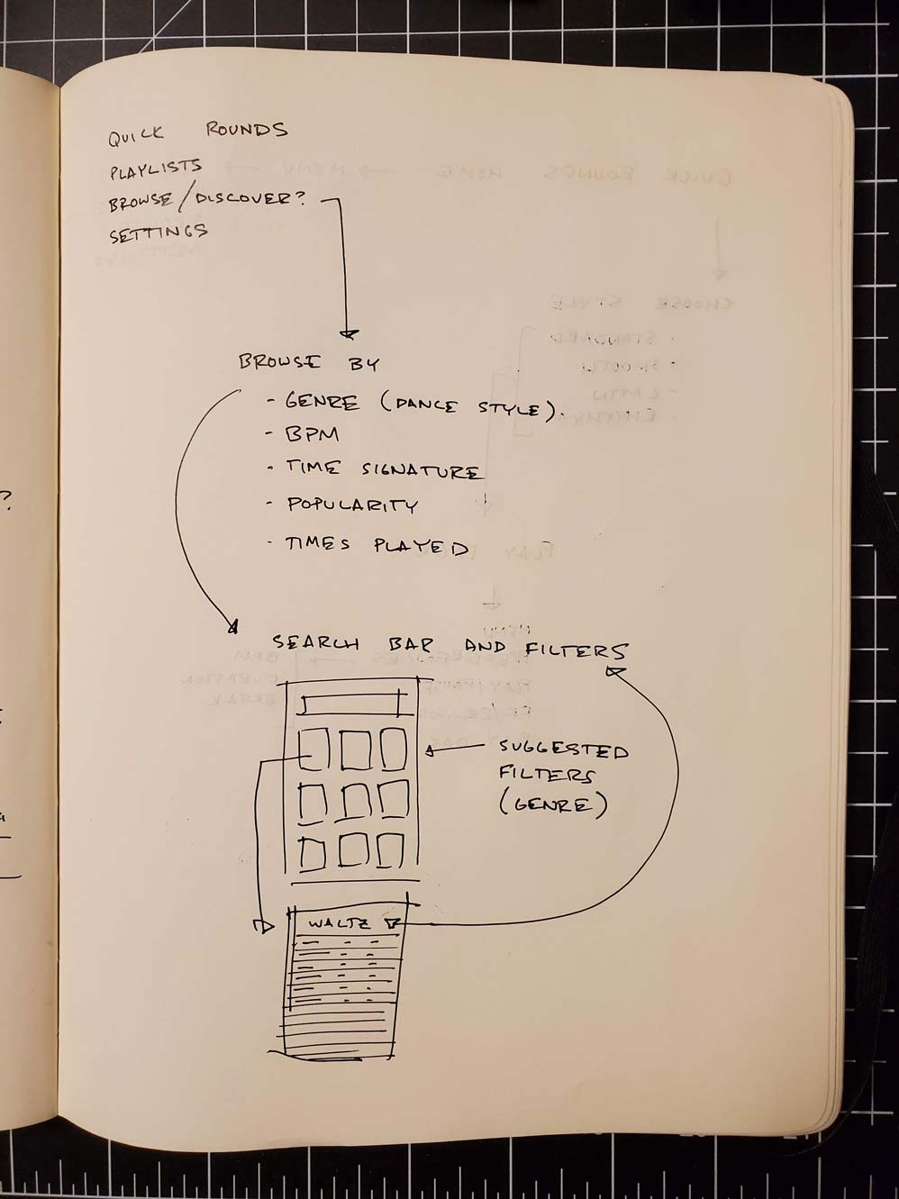
This was an app that was more for myself than anyone else. I was just starting to learn ballroom at this time, and frankly nothing really made sense to me. I wanted to be able to break things down step by step, but there were so many things that would go into each step; I'd get confused anyway. As I grew more as a dancer, my needs grew differently as well. At first I needed a learning app. Later I needed an app that would store the playlists for each genre. Then I needed an app that would keep track of my competitve scores. For now this app remains a learning tool, but I hope to build it into an app that is useful for all levels of dancer soon. You can view my sketches and brain dumps below.
Improvements for the Future
Given more time, I'd like to work more on the figure detail card a little more. There's just so many resources that can be distilled into this card. As of right now, it contains the bare basics: a video demo and the written instructions. In the future, tips from more experienced dancers or a way to view your previous recordings could definitely live in this card. I also think that the navigation system might have to be tweaked to allow for more depth within the app. Maybe it's something as simple as an X arrow in the upper right hand corner, but simply tapping to go back will only feasibly work for cards that are three or four layers deep.
Education
Carnegie Mellon University | May 2015
- Bachelor in Fine Arts | Communication Design
- Minor in Photography
Experience
Elsevier | User Experience Lead | 2020 - 2025
- Redesigned the Sherpath experience for nursing students and instructors
- Increased usability scores for Sherpath by an average of 20 points (SUS) over a 2 year period
- Conducted user research to solidify concepts and designs
- Designed and prioritized the release of new features for products across Elsevier
- Worked to incorporate Elsevier’s Artificial Intelligence (Large Language Model) into the product suite
- Actively contributed to and organized the Elsevier style guide
- Managed analytics through New Relic and Pendo
PNC Bank | Senior Digital Experience Designer | 2018 - 2020
PNC Bank | Digital Experience Designer | 2015 - 2018
- Redesigned PNC Mobile for Android and iOS from the ground up
- Brought Apple app store rating from 1.9 stars to 4.8 stars
- Developed and maintained the PNC Mobile Style Guide across iOS and android
- Designed new features and flows to enhance the PNC Mobile experience
- Revisited shipped flows to keep them current and up to date
- Conducted user research to inform new features and designs
- Made sure PNC is up to date on current design practices
- Communicated across product teams to ensure a universal PNC experience regardless of platform
Automoblox | Web Designer | 2014
- Redesigned Automoblox's website
- Created a new navigation system for the website and product manuals
- Restructured information architecture and set the layout for product manuals
Bearded | Web Design Intern | 2013
- Maintained woodtyperevival.org using Ruby on Rails
- Converted wood typefaces to digital typefaces
- Produced posters using a letterpress
Skills
Adobe Creative Suite
- Ai, Ps, Dw, Id, Ae, Au, XD
Rapid Prototyping
- Sketch, Invision, Framer, Figma
Web Development
- HTML, CSS, Javascript, jQuery
Programming
- Python, Ruby, Ruby on Rails